Cards: updating features
From the list of cards of a class, you can access the update features of the selected card, opened in a dedicated popup window.
The update features available in CMDBuild allow you to insert, update and consult cards, create and view relations, review change history, send and consult emails, and upload and view attachments.
In the grids displayed in the various tabs you can:
- modify column width
- sort columns by clicking on the header (first click ascending, second descending)
- add or remove attributes from the grid
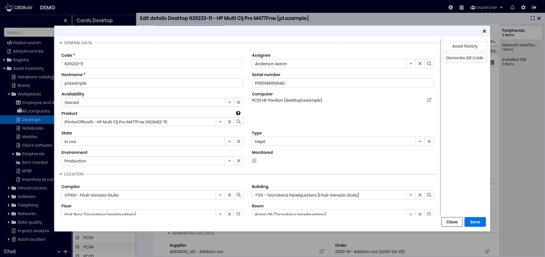
Card modification popup
The first view of the card update popup is shown below.
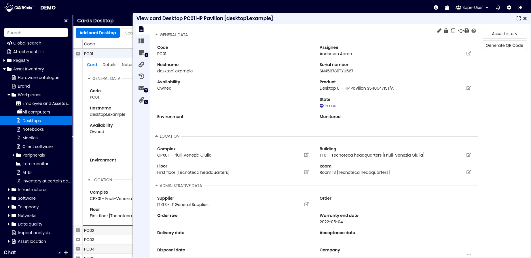
The icons on the left allow you to:
- view and update card information (current icon)
- view and update detail cards
- view and update notes
- view and update relations
- view card history
- view and update linked emails
- view and update attachments
Attributes are usually arranged in two columns. If a custom layout is configured in the Administration Module, fields may appear differently, as shown below.
Card TAB
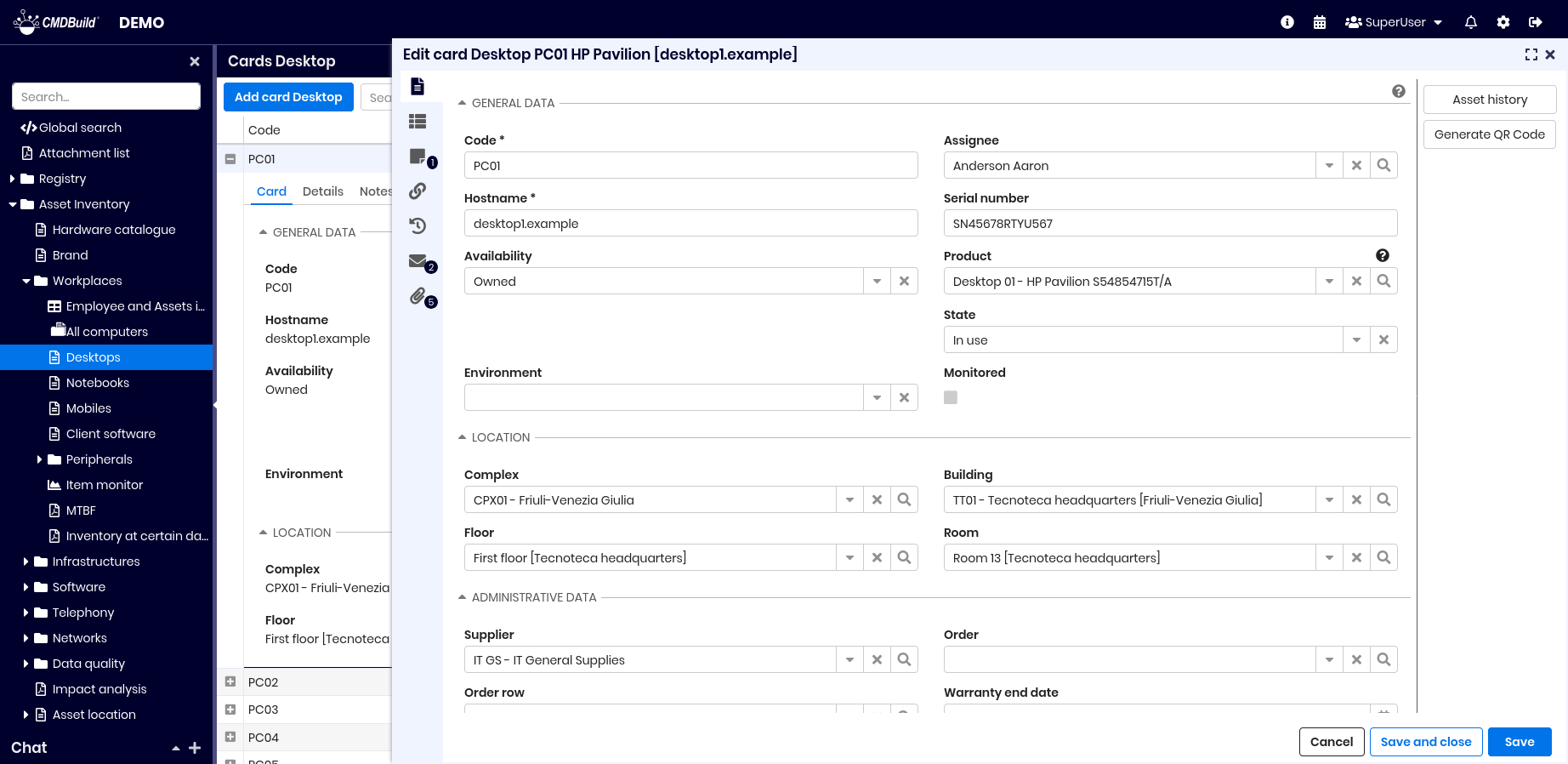
The Card tab allows viewing and updating information of the current card.
Available actions:
- edit the current card
- delete the current card (logical deletion)
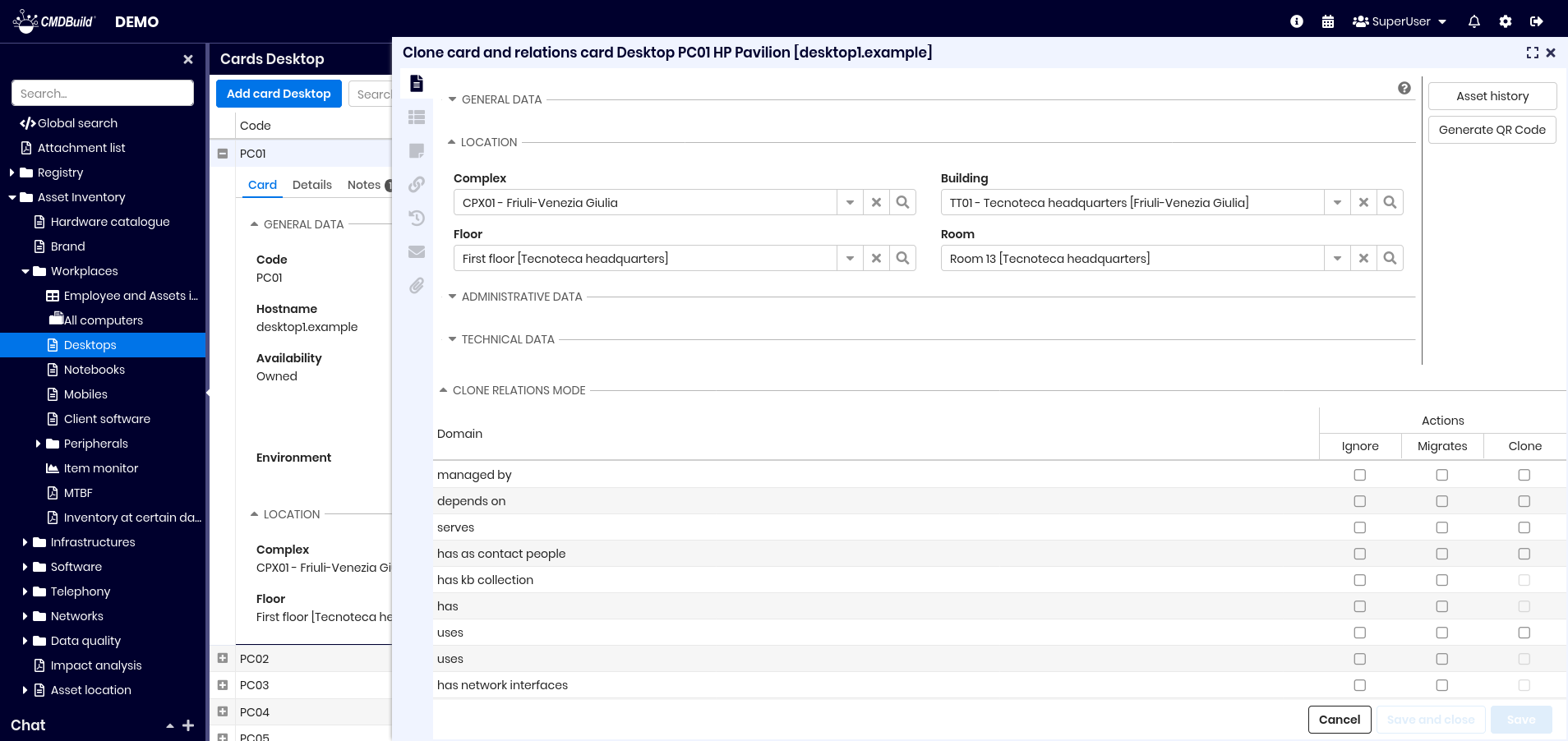
- clone the card, with optional cloning of relations (see Cloning with relations)
- open the relation graph
- print the current card (PDF or ODT)
- view help text in a popup
If the card has an associated BIM project, an additional tool allows opening a popup with the related 3D model.
When a card contains many attributes, they can be organized into fieldsets such as General or Administrative data.
The fields displayed during insert or update operations are defined in the Administration Module, which sets:
- editable fields (Editable mode)
- read‑only fields (Read Only mode)
Cards are displayed in two columns following administrator-defined order unless a custom layout is configured.
Additional functionalities include:
- tooltips with help for each field
- auto values based on other fields
- validation rules
- conditional visibility of fields
- quick navigation to referenced cards via icon
- automatic operations on opening or confirming a card
Guide to compilation
The interface generates forms based on the configured class.
Available field types:
- standard fields for characters, strings, numbers or hours
- multi‑row text fields (plain or formatted)
- password fields
- boolean fields
- IP fields (IPv4 and IPv6)
- date fields with calendar widget
- LookUp fields:
- value selection with filter typing
- reset option
- LookUp array fields:
- multiple value selection
- reset option
- reference fields:
- selecting a value creates a relation in the Relations tab
- popup for large lists
- reset option
- link fields (URL with custom label)
- file fields stored in the document repository
- formula fields (SQL or Groovy)
If attributes exceed available height, a scrollbar appears.
Card lock
If card locking is active and a user selects Edit card, the system reserves the card for a configured time.
If another user tries to edit the same card during that period, an error appears.
The card is released when the first user confirms or cancels the edit.
Widget
Widgets configured in the Administration Module allow context‑specific operations.
Available widgets for standard cards include:
- Calendar
- Create / modify card
- Create report
- Link card
- Start workflow
Custom widgets (ExtJS, JavaScript) can also be implemented.
Calendar
Displays calendar events from another class. Configuration requires:
- source class
- optional filter
- visualization date
- title field
Create / modify card
Displays a card from another class, read‑only or editable. Requires:
- class
- card identifier (fixed or parametric eCQL)
Create report
Prints a Jasper report. Requires:
- report name
- output format (PDF or CSV)
- parameters
Link card
Allows selecting one or more cards from a filtered list.
Commonly used to select assets during ticket creation.
Start workflow
Starts a workflow from the current card, configured with:
- workflow type
- initial parameters
Cloning with relations
When cloning a card including relations, the duplicated card and its relations can be edited.
For each relation you can choose:
- Ignore — relation is not cloned
- Move — relation is moved to the cloned card
- Clone — relation is duplicated (if cardinality allows)
Details TAB
Master–detail structures are supported through a domain with Master Detail enabled and a reference field in the detail class.
Multiple detail classes may appear as tabs in the popup.
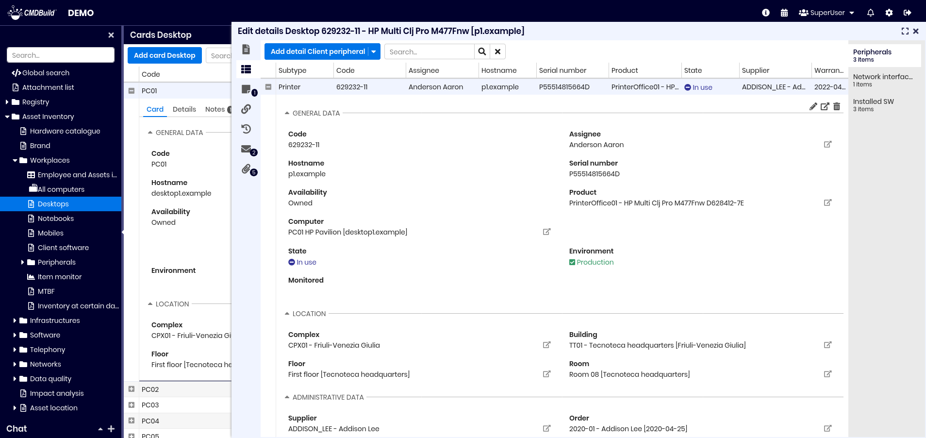
Available actions:
- add a new detail card
- perform free‑text searches
- switch between detail types
- expand rows to:
- edit the detail card
- display it in its own popup
- delete it (logical delete)
Guide to compilation
When inserting or editing a detail card, the reference to the master card is pre‑filled and cannot be modified.
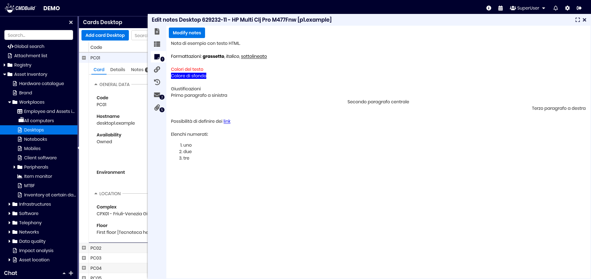
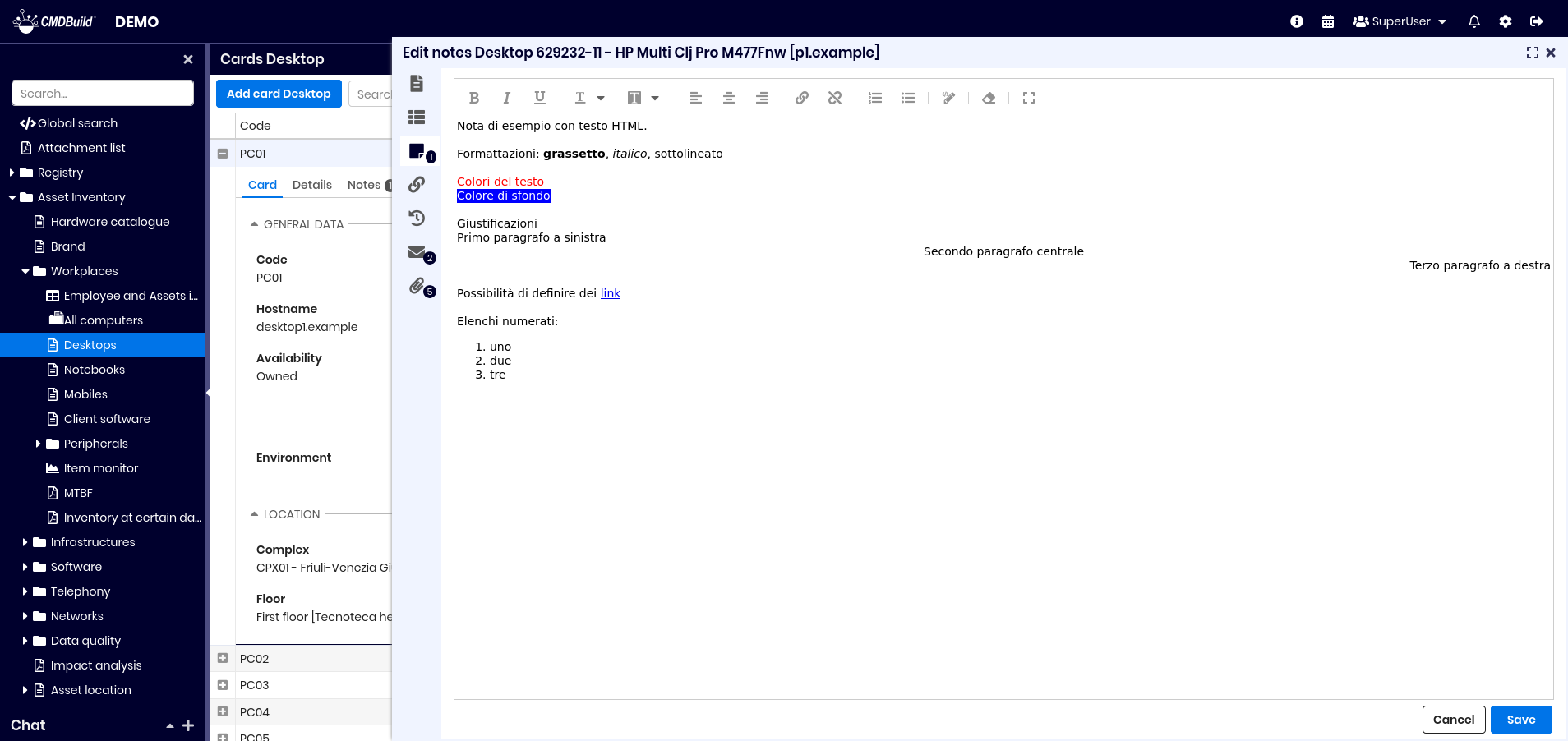
Notes TAB
The Notes tab allows viewing and editing notes related to the card.
The integrated HTML editor supports:
- bold, italic, underline
- font and background color
- alignment
- hyperlinks
- numbered and bullet lists
- HTML source view
- clean HTML
- expand/reduce editor
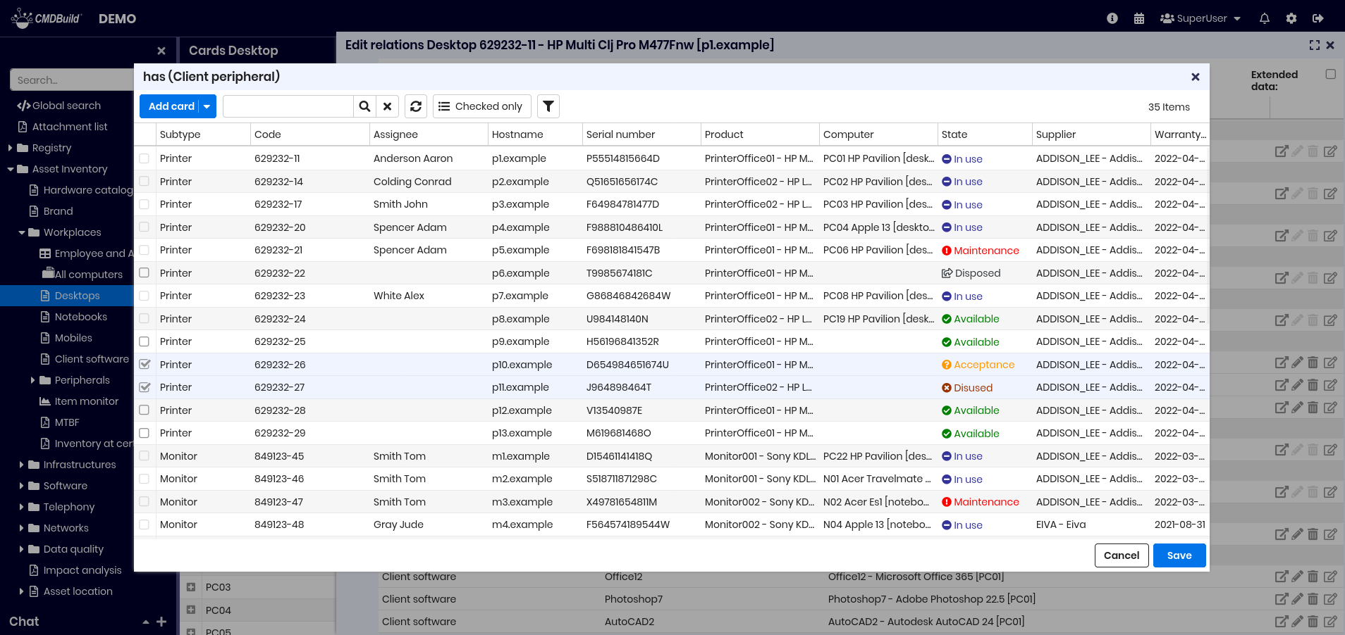
Relations TAB
The Relations tab allows viewing and creating relations.
Relations are grouped by domain and domain attributes are displayed if present.
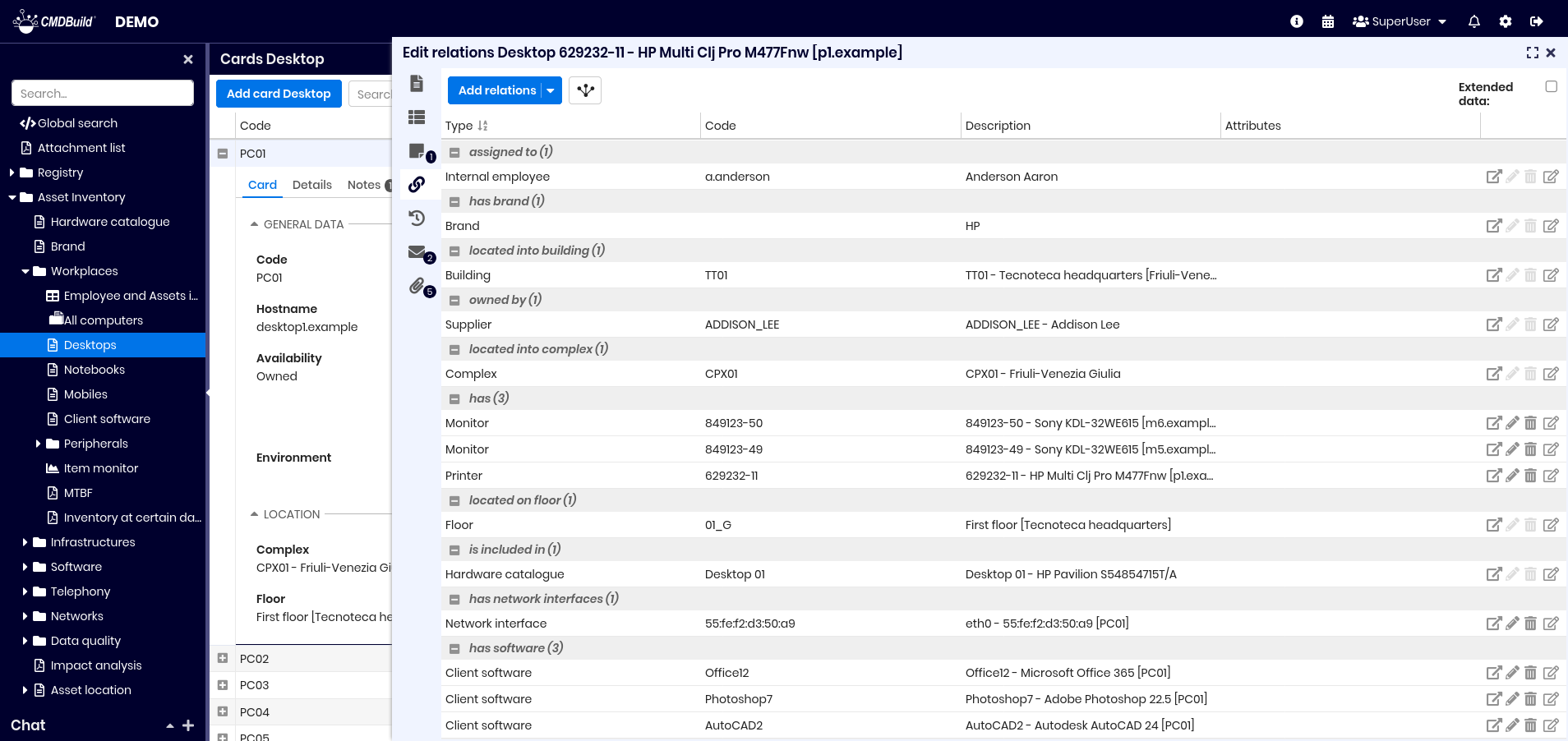
You can:
- create relations
- show the Relation Graph centered on the current card
- enable extended data view
Each relation allows:
- navigating to the related card
- editing the relation
- deleting the relation
- editing the related card
This is an example of the interface in case you select the flag to view extended data.

Creating a new relation
Selecting Add relation displays the domains available for that class.

After choosing a domain, select one or more cards depending on cardinality.
History TAB
The History tab displays all changes applied to the card.
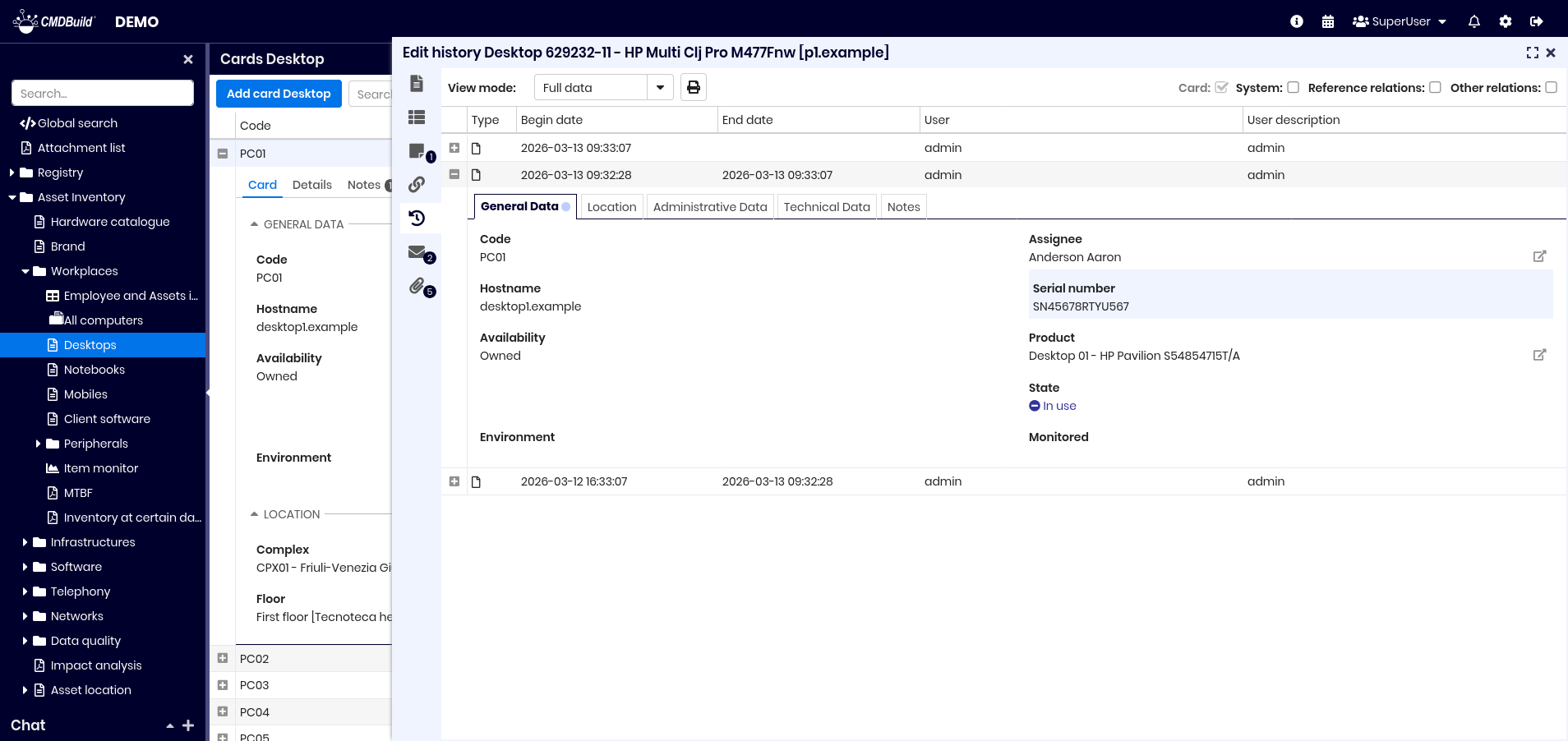
Guide to consultation
Each version appears as a row and can be expanded.
You can view:
- start and end date
- user who made the change
- attributes grouped into tabs
- attributes changed (highlighted)
Tabs containing changes display a blue dot.
Emails TAB
The Emails tab manages email exchanges related to the card.
Possible email statuses are: received, sent, draft, outgoing, error, and skipped.
Sending and receiving emails are managed through the Task Manager.
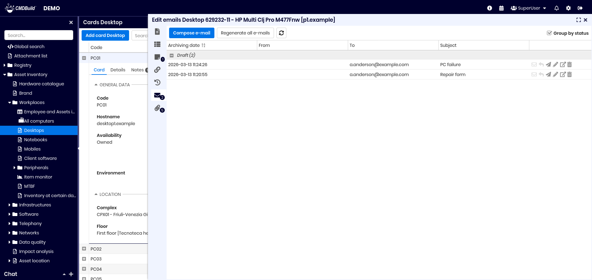
Available actions include:
- write a new email
- regenerate unsent emails
- refresh grid
- group emails by status or sort by date
Row tools allow you to perform the following operations in the current email:
- regenerate
- reply
- send
- edit
- view
- delete
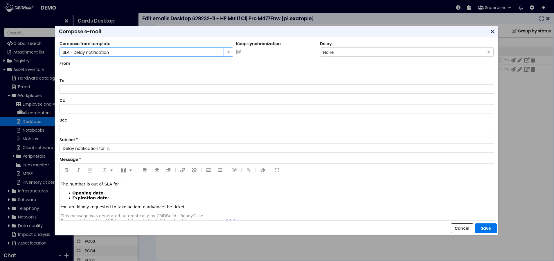
When creating or editing an email you can:
- select a template
- sync content with card data
- set a delivery delay
- attach files
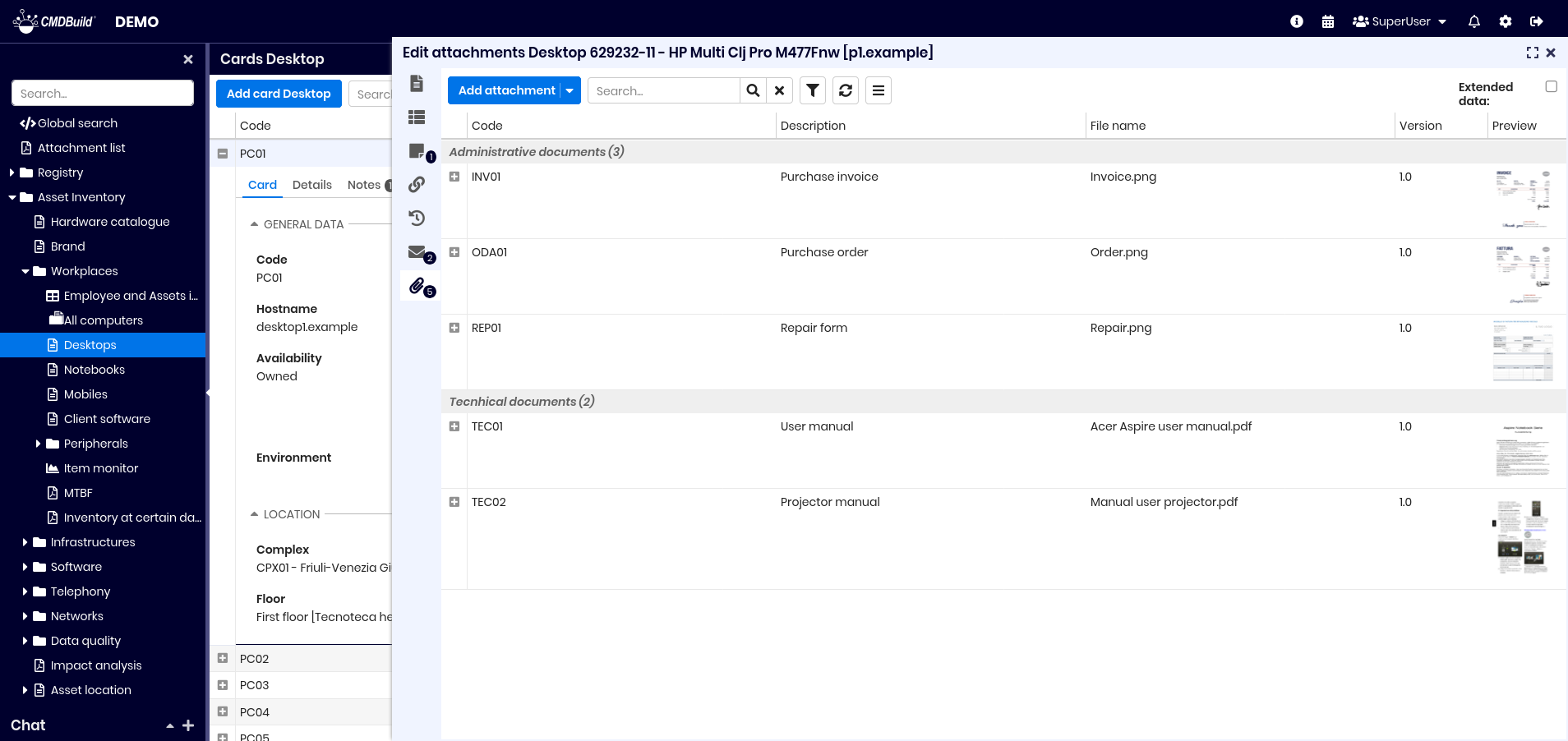
Attachments TAB
The Attachments tab allows uploading and managing files linked to a card.
CMDBuild integrates with CMIS‑compatible DMS systems such as Alfresco or SharePoint Online.
Attachments may have categories, defined per class or globally, specifying:
- minimum or maximum number of files
- associated document class
- metadata definitions
Versioning is supported.
This is an example of the interface in case you select the flag to view extended data.
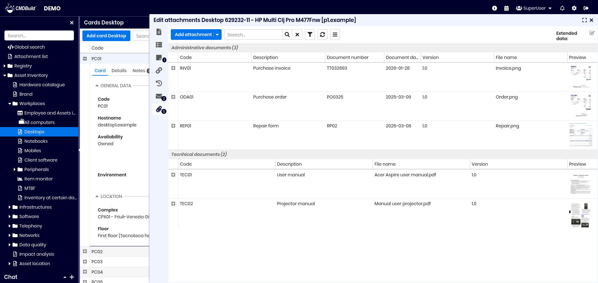
Metadata can be viewed:
Available actions:
- add attachments
- search
- filter metadata
- refresh
- contextual menu
- show extended data
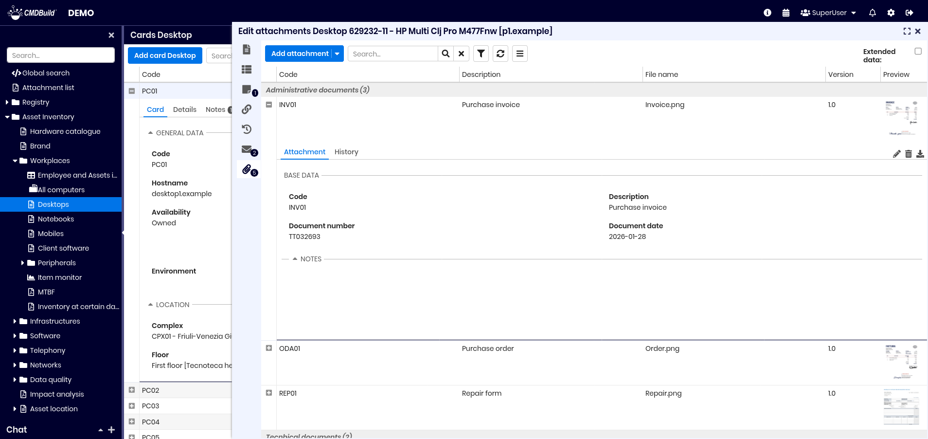
When expanding an attachment you can:
- edit metadata or upload a new version (minor or major)
- delete
- download
- preview
Upload of attachments
Upload begins by selecting a document category.

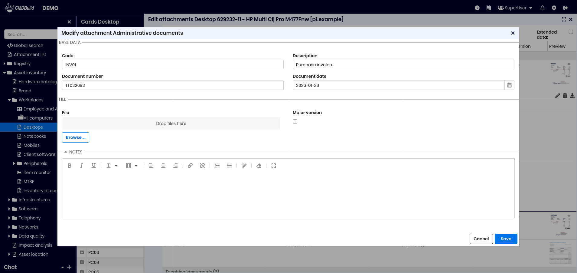
You must:
- fill in Code and Description
- compile metadata fields
- upload files (button or drag‑and‑drop)
- add notes (optional)
Allowed file extensions may be limited globally or by category.
Attachment versions
When editing a file, CMDBuild creates a new version and asks whether it is:
- minor version (1.1, 1.2…)
- major version (1.0, 2.0…)
Each version displays:
- creation date
- last change date
- author
- author description
- version number
- file name
- description
All versions can be downloaded.