Cards: consultation features
Through the available navigation menu, users can access the classes configured in the system and work in the central area on the list of cards belonging to each class.
The menu is configured by the system administrator for each operator group and can be freely organized with folders and subfolders containing classes, processes, reports, dashboards, views and custom pages and navigation trees.
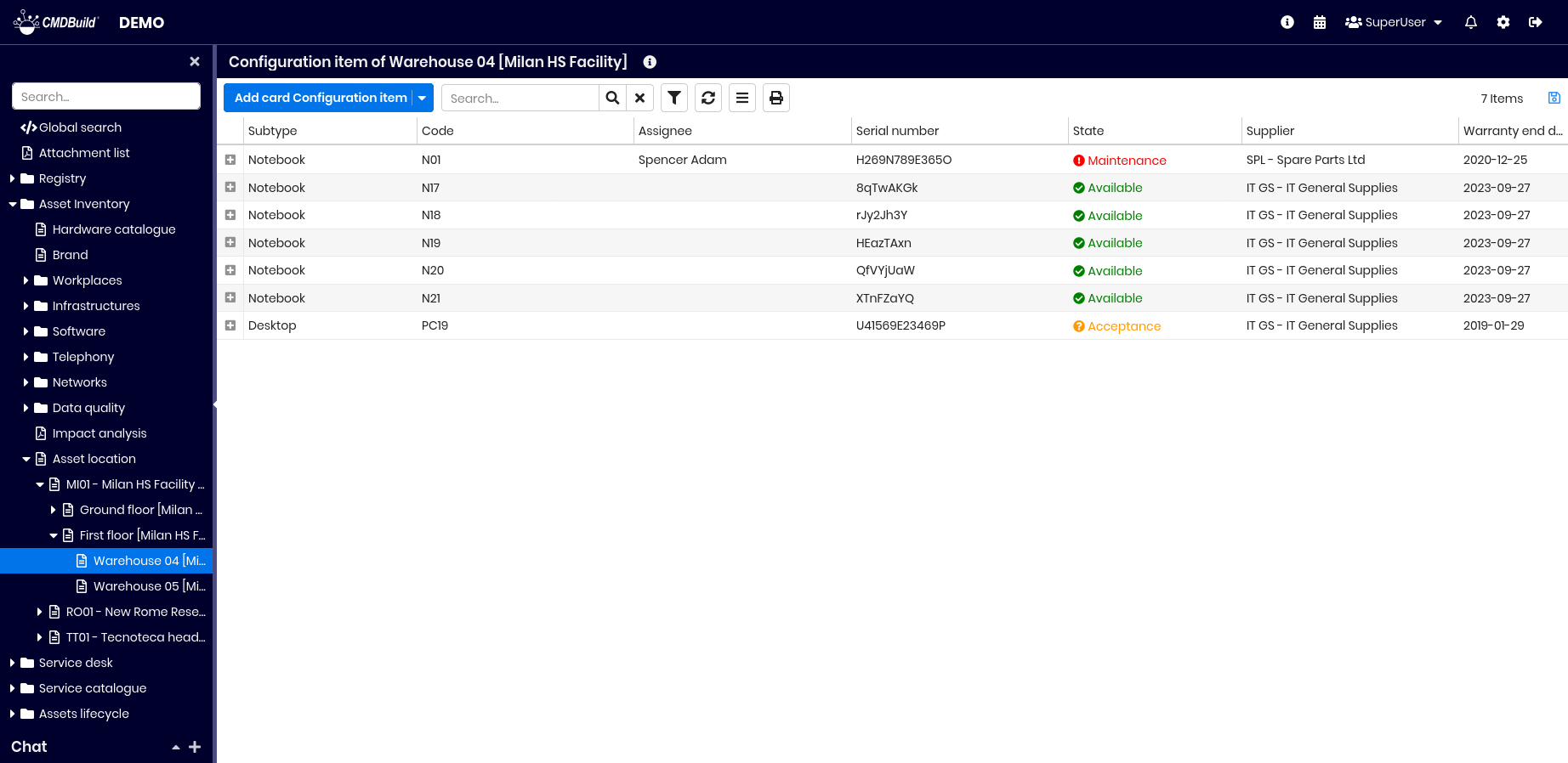
The menu can be organized either by element type or as a hierarchical navigation path. For example: starting from the Building class, then accessing the list of floors, then rooms, and finally the IT assets contained in each room (as shown below)
Card List
The data of the current class are initially displayed in a table.
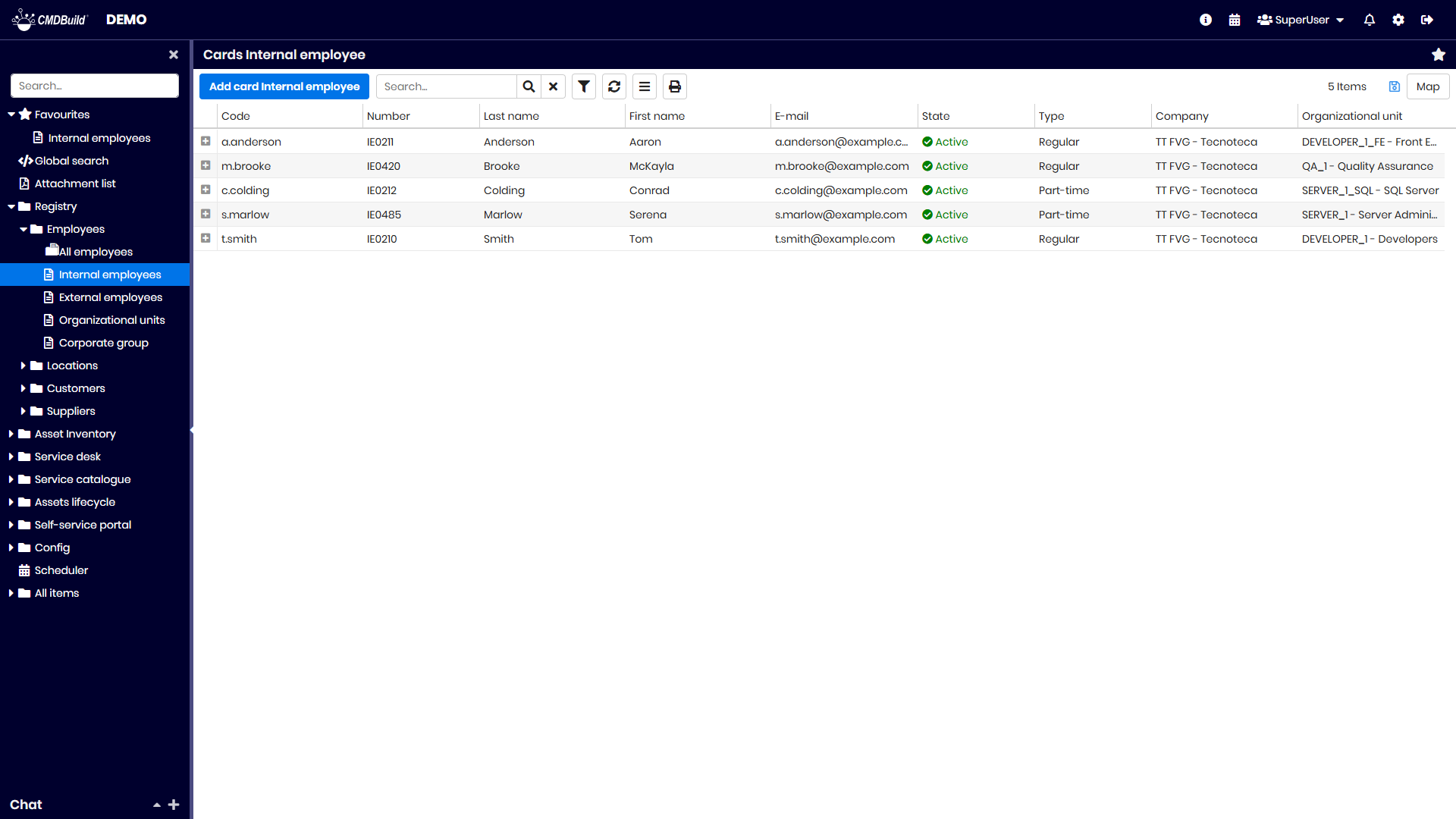
In the top bar, in addition to the class name, a star icon allows adding the class to the favorites section in the left menu.
Between this bar and the grid, a set of buttons provides the following operations:
- create a new card
- perform free‑text searches on the displayed data
- access and manage filters (see Advanced search filter)
- refresh the page
- access the Contextual menu for functions relevant to the current context
- print the cards displayed in the table (PDF or CSV)
- save the table preferences, which become the default configuration for the current user
- access the Map view to display georeferenced cards on maps, plans and 3D models (see Georeference on geographical maps, 2D georeference on planimetries and Georeference on 3D models)
In the table header you can:
- adjust column width
- sort columns by clicking on the header (ascending on first click, descending on second)
- add or remove attributes displayed in the table (default columns are configured in the Administration Module)
- set filters on each column
Card TAB
This tab displays the current card with all its attributes, organized into fieldsets.

The tools in the top‑right corner allow the following operations:
- display the selected card in a popup window
- edit the selected card in a popup window
- delete the selected card (logical deletion)
- clone the card, with or without relations
- open the relation graph
- print the selected card (PDF or ODT)
- view help text in a popup window
If the card has an associated BIM project, an additional tool allows opening a popup with the related 3D model.
For more details about card management, see the Card TAB.
Details TAB
This tab displays the cards linked to the current one through Parent‑Child (Master–Detail) relations, organized into sub‑tabs.
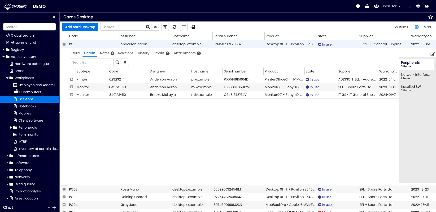
The tool in the top‑right corner allows accessing and editing child cards via a popup.
If configured in the Administration Module, the system can automatically calculate the sum of numerical columns in the detail grid.
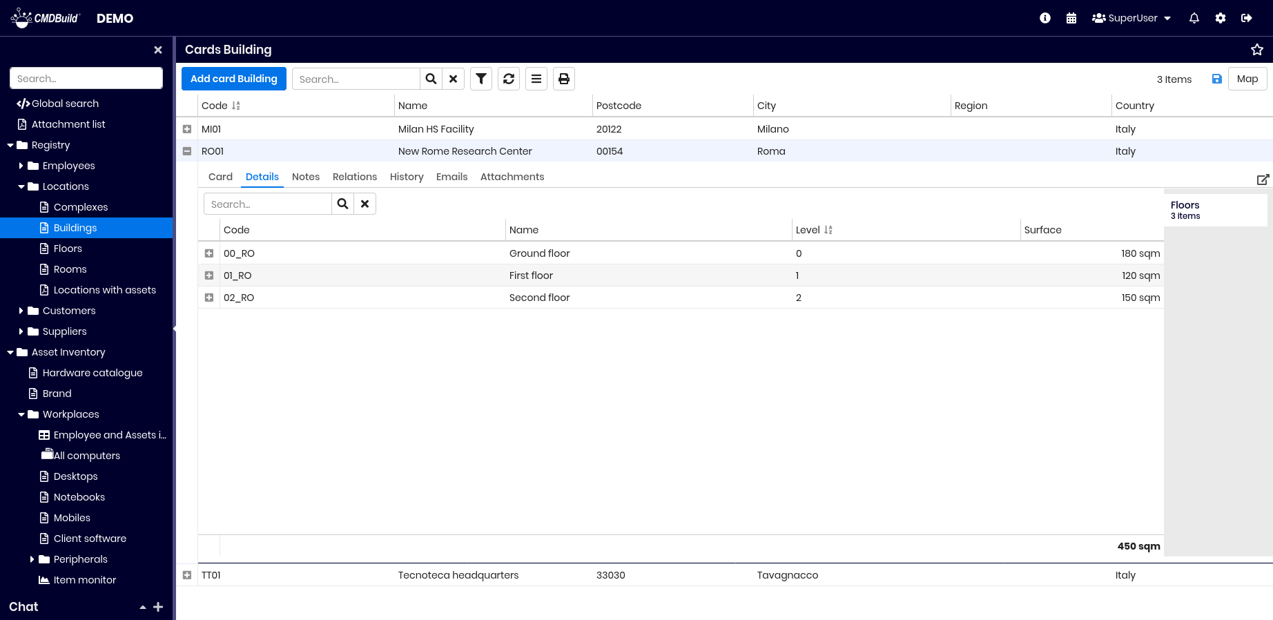
For more details, see the Details TAB.
Notes TAB
This tab displays the notes associated with the current card.
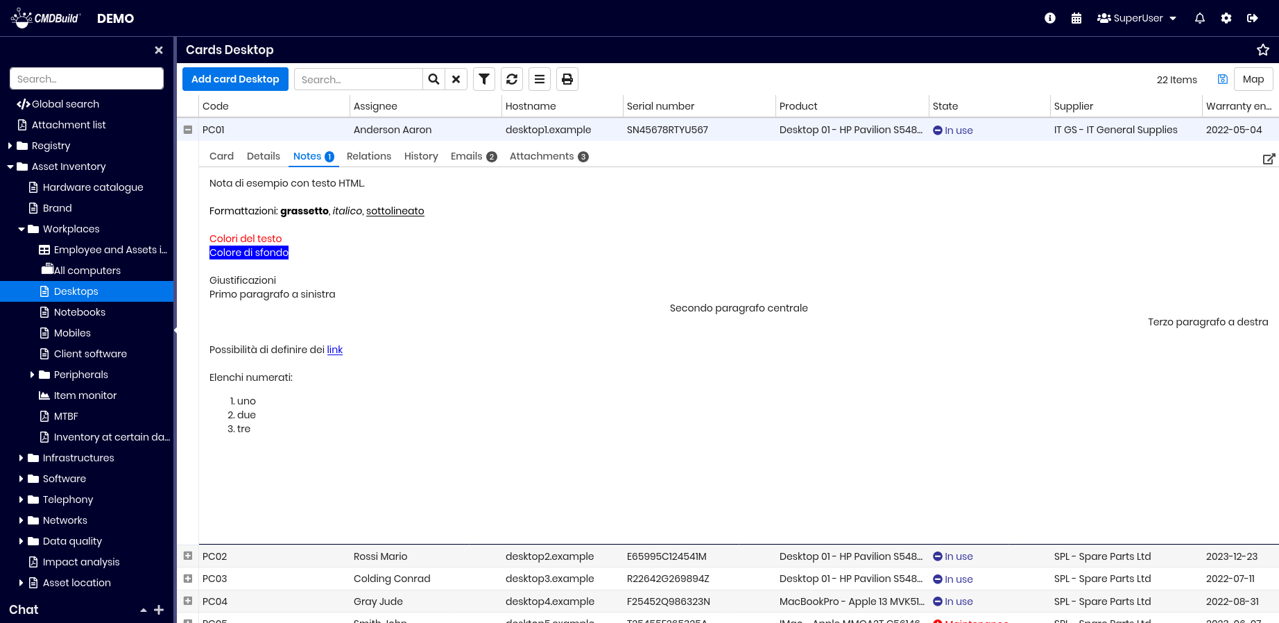
The top‑right tool allows opening and editing notes in a popup.
The presence of notes is indicated by a counter next to the tab name, for example (1).
For more details, see the Notes TAB.
Relations TAB
This tab displays all cards related to the current one, for all relation types (1:1, 1:N, N:1, N:N).

Available operations:
- access and edit relations through a popup (top‑right tool)
- navigate to related cards using the button on the right or by double‑clicking
- display extended data of related cards using the extended data checkbox

For more details, see the Relations TAB.
History TAB
This tab displays all versions of the current card, including start and end validity dates, the user who performed each change and the attribute values for every version. Modified values are highlighted.
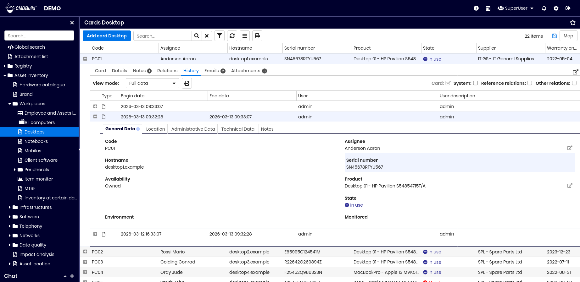
Available operations:
- view card history in a popup (top‑right tool)
- display operator‑generated changes (Card checkbox)
- display system‑generated changes (System checkbox)
- display changes to reference relations (Reference relations checkbox)
- display changes to other relation types (Other relations checkbox)
For more details, see the History TAB.
Emails TAB
This tab shows emails linked to the current card, grouped by status (draft, outgoing, received, sent, error, skipped).
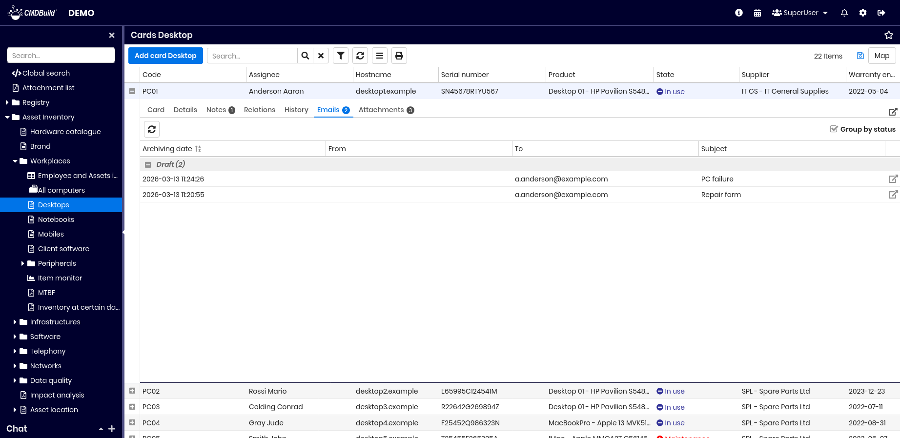
Available operations:
- view email history in a popup (top‑right tool)
- refresh the grid
- group emails by status or sort by date (Group by status checkbox)
- view full email content using the button on the right
For more details, see the Email TAB.
Attachments TAB
This tab displays the list of documents and files attached to the current card.
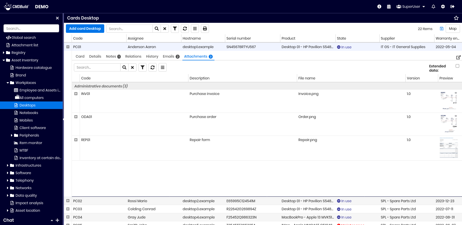
Available operations:
- access and edit attachments in a popup (top‑right tool)
- use tools on the left to:
- search attachments by text
- filter data
- refresh the grid
- access the attachment contextual menu
- preview the selected attachment in a popup, with download option
- display extended metadata using the extended data checkbox

If custom metadata are defined for a document category (for example Document number and Document date for Administration documents), all metadata values can be displayed:
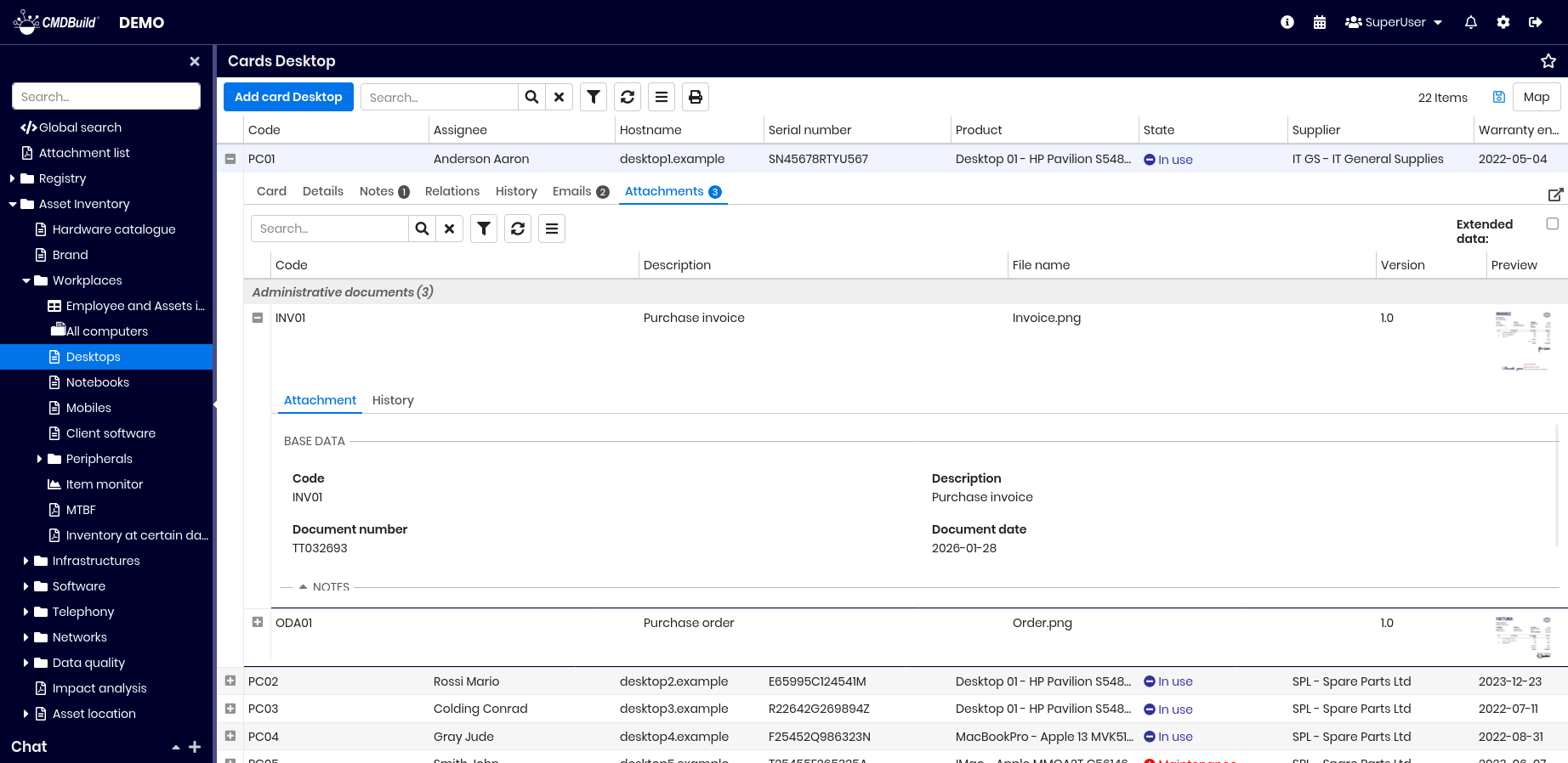
The History TAB for attachments allows viewing file version details over time.

For more details, see the Attachment TAB.