Cards: advanced features
In this chapter we describe several advanced features available in CMDBuild to consult and manage data cards. These features include:
- searches with advanced filters
- use of the contextual menu
- use of scheduling
- views from join
- data import/export
- massive modification and deletion
- graphical display of relations (Relation Graph)
- georeferencing of cards on geographical maps, vector maps and 3D models
Advanced search filter
For each card type you can apply filters to display only the cards you want to view.
You can select filters created by the administrator or configure new filters directly in the Management Module by the specific icon
Filter on attributes
An advanced filter allows selecting data cards by applying multiple search conditions on any attribute of the class.
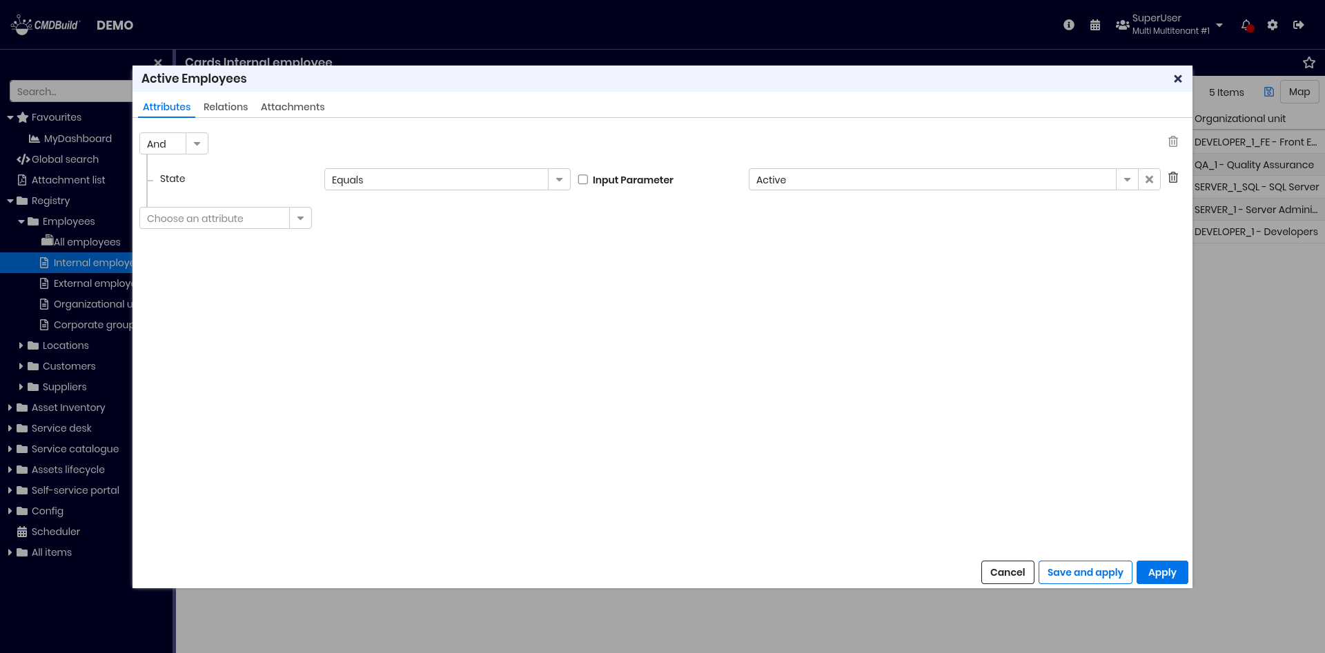
In the example, the filter selects active employees who have a permanent contract (no final date) or a contract expiring after 1 January 2026.
On each filter row you can:
- choose an attribute to filter
- select an operator (based on attribute type)
- enter a value or select one (for references or lookups)
- request value input at filter execution time
- delete individual filter conditions
Filters can contain multiple conditions. They can be saved and reused, optionally with parametric values requested at execution.
When applied, the table displays only matching cards and the filter name is shown at the top.
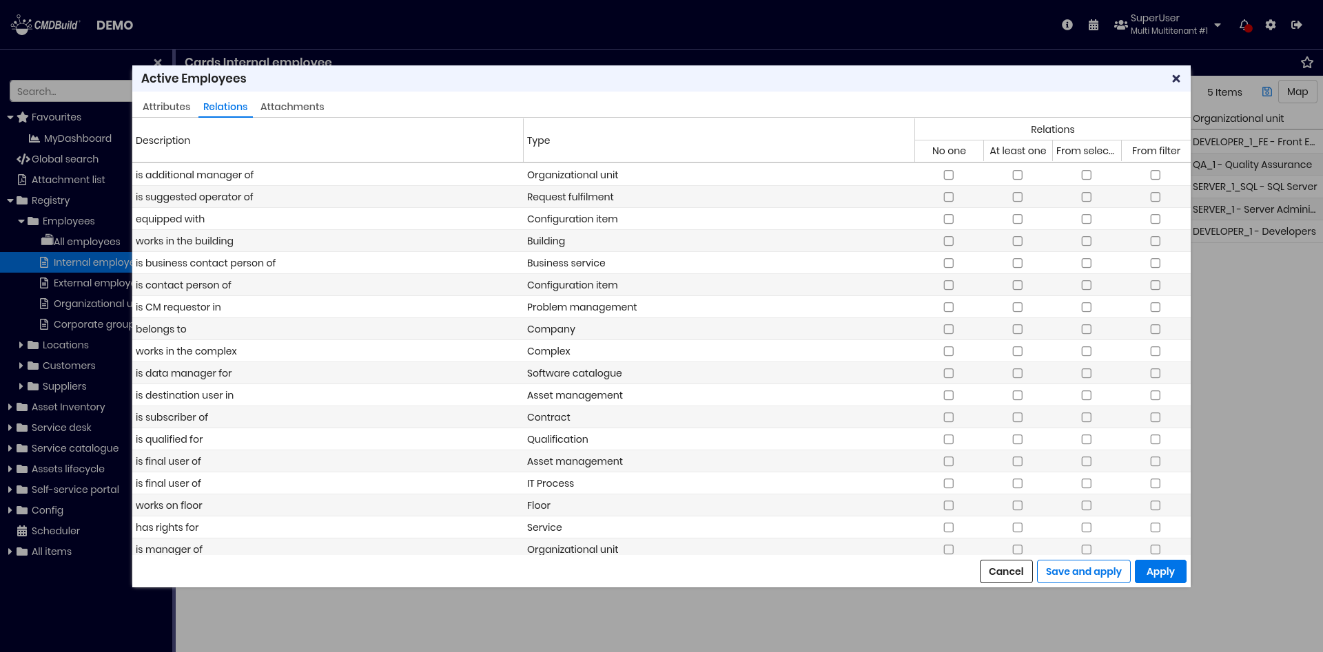
Filter on relations
Through the Relations tab you can define filter criteria based on domains associated with the current class.
A relation filter allows selecting:
- cards without relations on the selected domain
- cards with at least one related record
- cards manually chosen among related records
- cards selected via a filter on the linked class
In the example, the filter extracts employees who:
- have at least one assigned asset
- belong to a company headquartered in Italy
Filter on attachments
Through the Attachments tab you can define filter criteria based on card attachments. You can:
- perform full-text search on attachments
- apply filters on attachment metadata

Filters can also combine criteria on attributes, relations and attachments.
Change a filter
The active filter name is displayed above the grid. By clicking it you can:
- apply another filter
- create a new filter
- edit, clone or delete an existing filter
- set a default filter for the current class
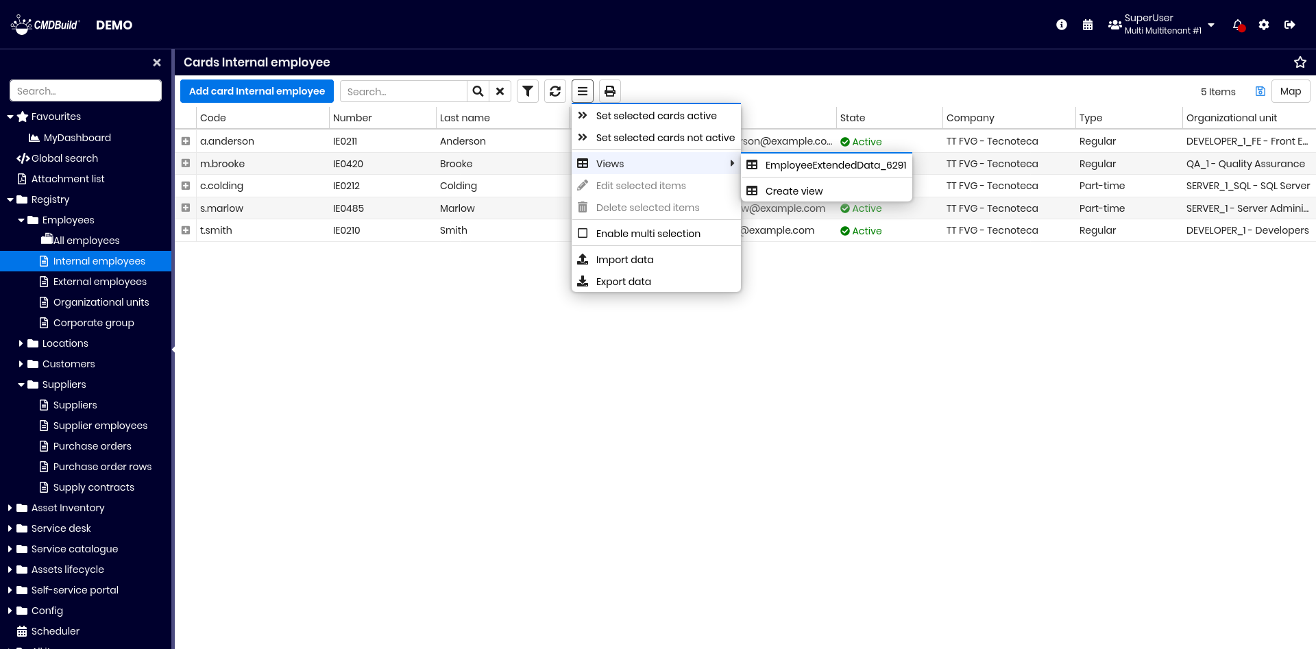
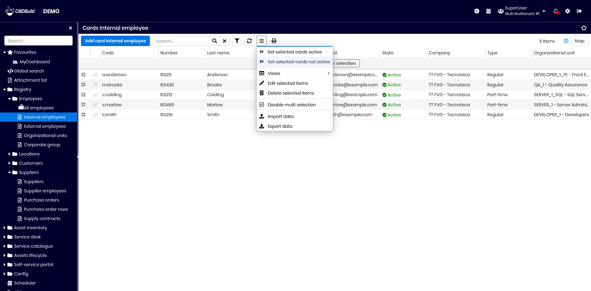
Contextual menu
The contextual menu provides commands relevant to the current context and simplifies their execution. It can include simple actions or open dedicated user interfaces.
Use of the contextual menu
Open the contextual menu by clicking its icon above the header row. It is configured in the Administration Module and may include:
- configuration and execution of views from join
- standard functions such as multiple selection, massive modification, massive deletion
- other features, if enabled (data import, data export)
- custom functions for the current card
- custom functions for selected cards
- custom functions for all cards in the grid
- separator lines
Each function may use system components or custom JavaScript code.

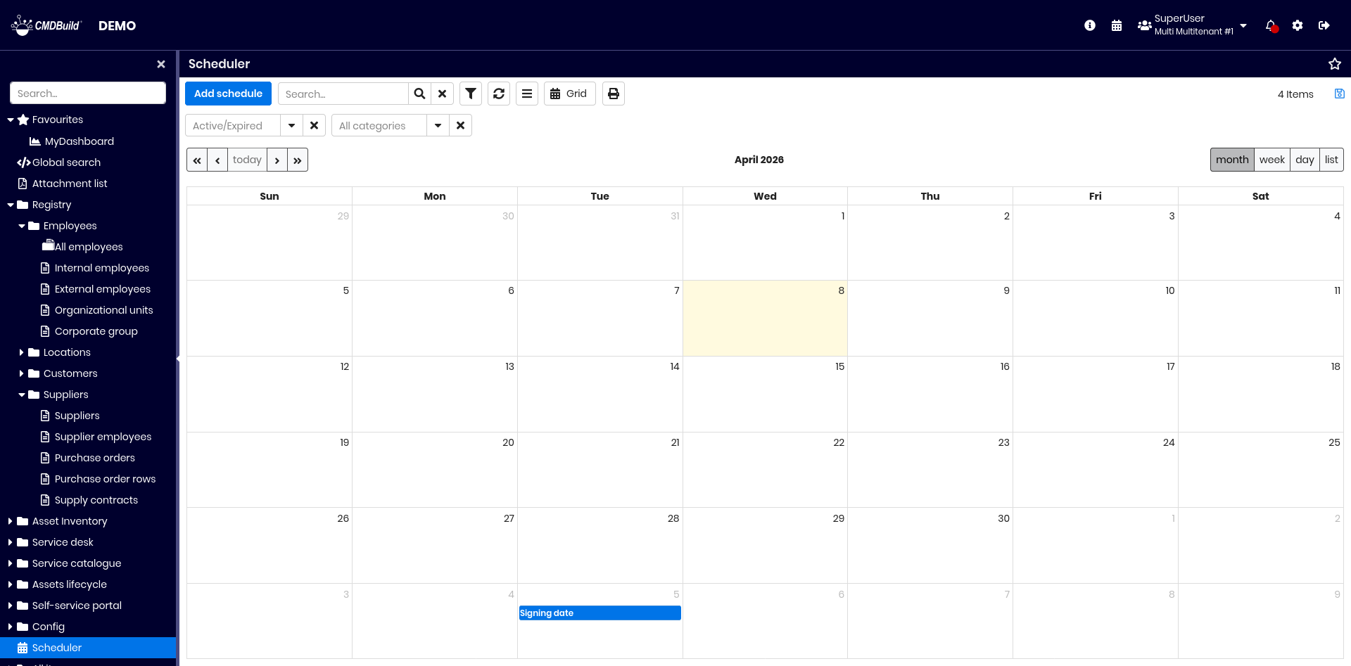
Scheduler
The Scheduler helps operators monitor procedures related to contracts, orders, certifications, warranties, recurring activities on assets and more.
Deadlines can be generated automatically when inserting cards that contain attributes marked as deadline, or they can be inserted manually into the Scheduling class.
The Scheduling class behaves like any standard CMDBuild class and supports filtering, printing and other standard features.
Generation of deadlines when updating cards
When inserting a card that contains a date attribute configured as a deadline, the system displays the following interface:
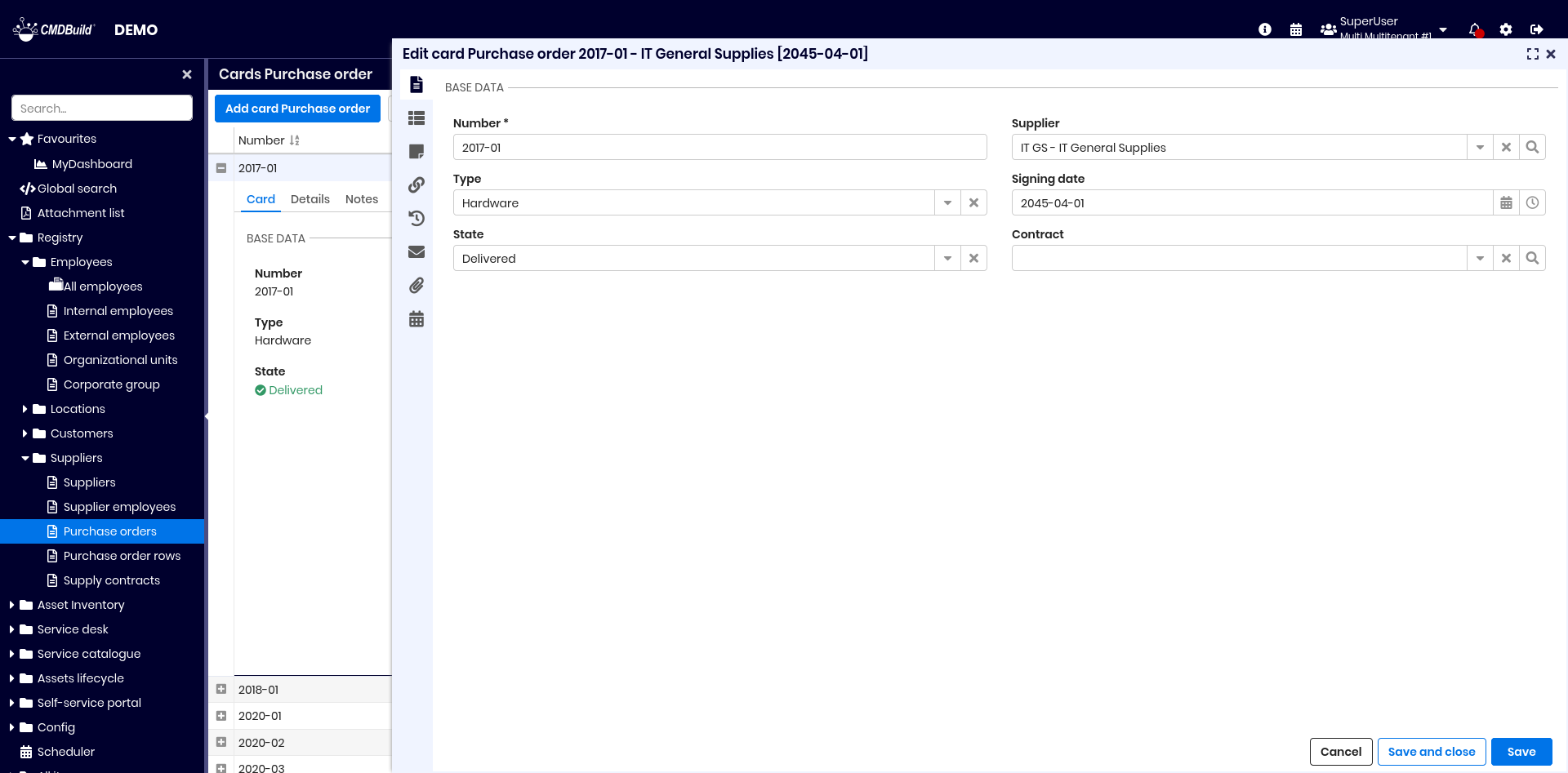
Since the attribute Signing date is configured in the Administration Module to generate deadlines, an additional icon appears next to the field. By clicking this icon you can:
- view the list of deadlines generated according to the defined rules
- regenerate deadlines if the operator has modified criteria
- edit individual deadlines after recalculation
These edits can be useful for adjusting date rounding or customizing generated notifications.
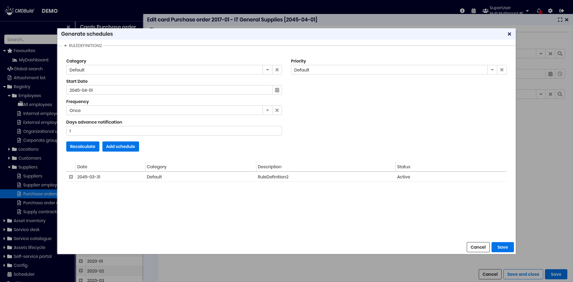
After confirmation, deadlines are generated and added to the Scheduler.
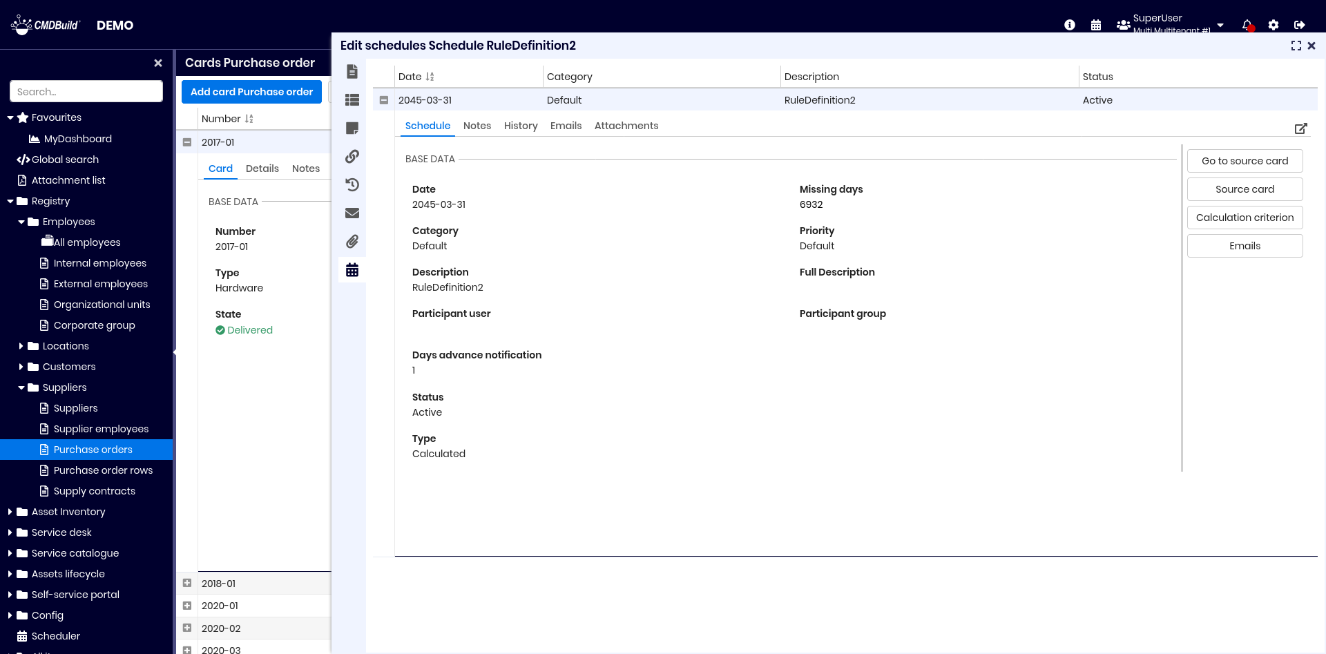
If a card contains deadline‑enabled attributes, a new tab appears in the card popup, allowing users to view deadlines and perform related operations:
Consultation and manual management
The Scheduling module is a CMDBuild core feature. It may contain automatically generated deadlines or manually inserted ones.
The scheduler can be accessed from the icon in the top bar or through the dedicated menu entry.
Available operations include:
- add a new schedule
- perform quick searches
- configure advanced filters
- refresh data
- access the contextual menu
- switch between calendar and grid view
- print deadlines in PDF or CSV
- save grid configurations
Additional filters:
- date filters (today, next 7 days, next 30 days)
- status
- category
Although it is a system class, the Scheduling module inherits all standard features of CMDBuild classes.
You can access it in read‑only mode and view all registered information.
The same information can be displayed in calendar mode.
It is also possible to manually insert or modify deadlines:
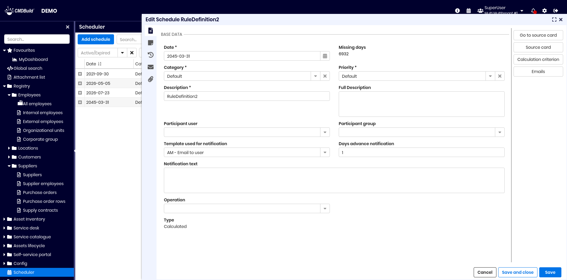
Each deadline includes:
- Date
- Missing days: (automatically calculated, read-only)
- Category
- Priority
- Description and full description
- Participant user: if set, only this user can view the deadline
- Participant group: if the user field is empty and the group is set, only operators in this group can view the deadline. If both are empty, the deadline is public
- Email notification template
- Advance notification (days)
- Email notification text
- Operation on the deadline: changed, closed, cancelled
- if closed, the execution date must be specified
- Type: automatic or manual. If set to manual, a new Class field is displayed, where you can specify the class on which to create the schedule (as defined in the administration module).
Available widgets:
- Go to source card: opens the card that generated the deadline
- Source card: displays the originating card according to the rules applied at save time
- Calculation criterion: displays the parameters of the generation rule
- Email: preview of the notification text sent by the system
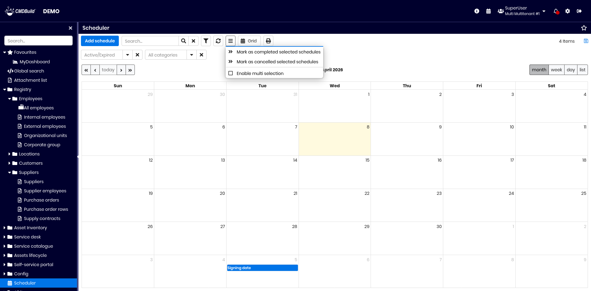
You can also close or cancel multiple deadlines using the contextual menu:
Views from join
Views from join allow the creation of combined views across multiple classes using visual joins.
These views behave like standard CMDBuild grids: text search, filters, contextual menu and CSV export are supported.
Access to features
Configuration and consultation of views from join are available from the contextual menu:
Creation of a view from join
A dedicated wizard guides users through several configuration steps.
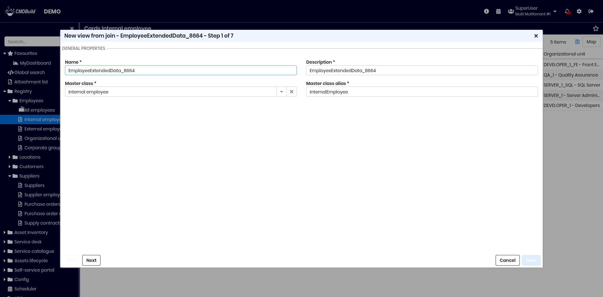
Step 1 — General properties
Define:
- Activity name
- Description
- Master class: original class for joins
- Master class alias
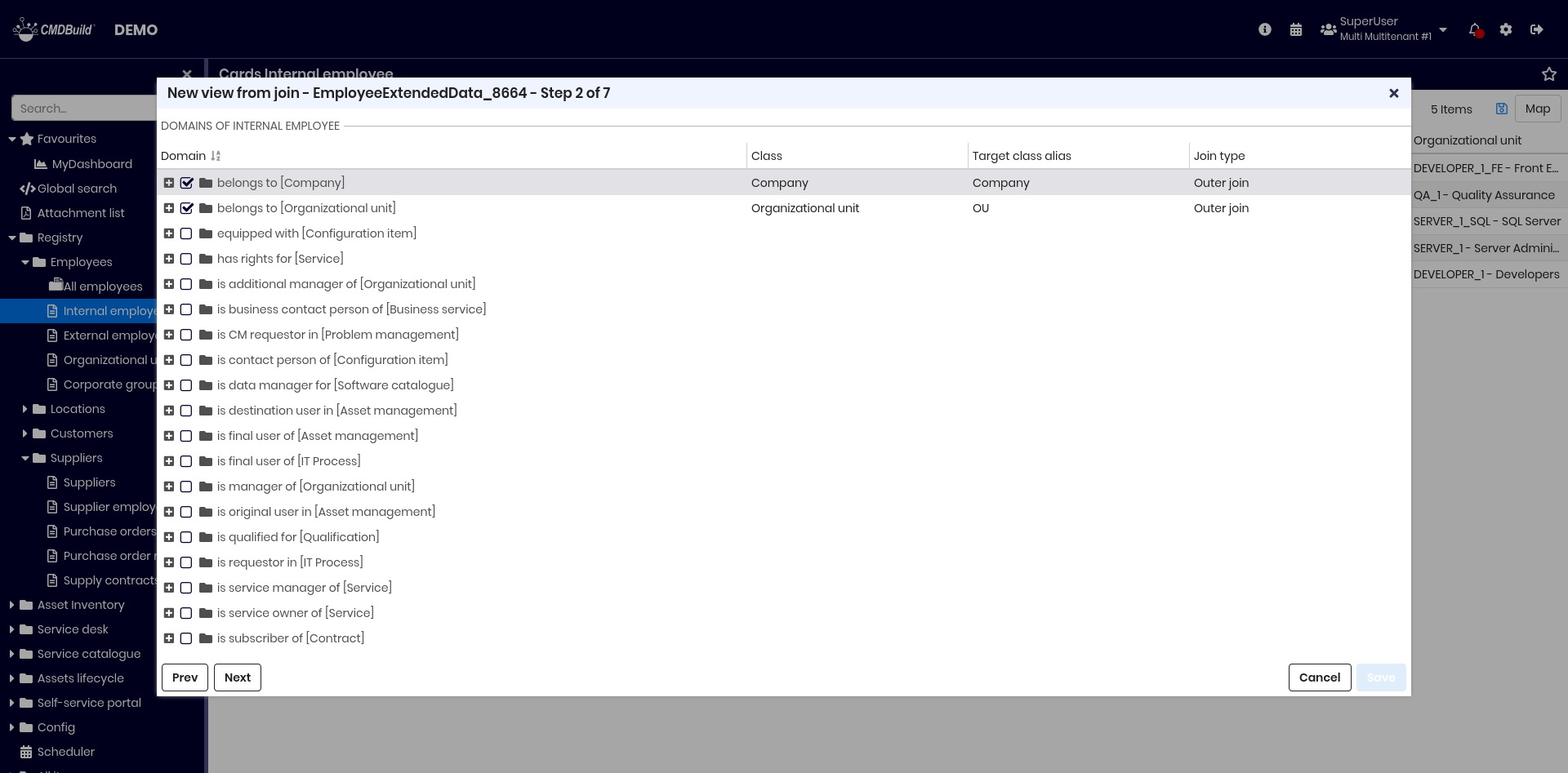
Step 2 — Join definition
Define joins by navigating class relations through domains (1:N).
For each linked class, you can set:
- alias
- join type (inner or outer)
Example: starting from CI, joins are defined with Company and Organizational Unit.
Step 3 — Definition of attribute groups
Define fieldsets to group selected attributes.

Step 4 — Attribute choice
Select attributes from the master and joined classes to be included in the view.

Step 5 — Attribute selection
For each selected attribute you can:
- assign an alias
- assign it to a fieldset
- choose whether it appears in the standard grid
- choose whether it appears in the reduced grid (mobile interface)

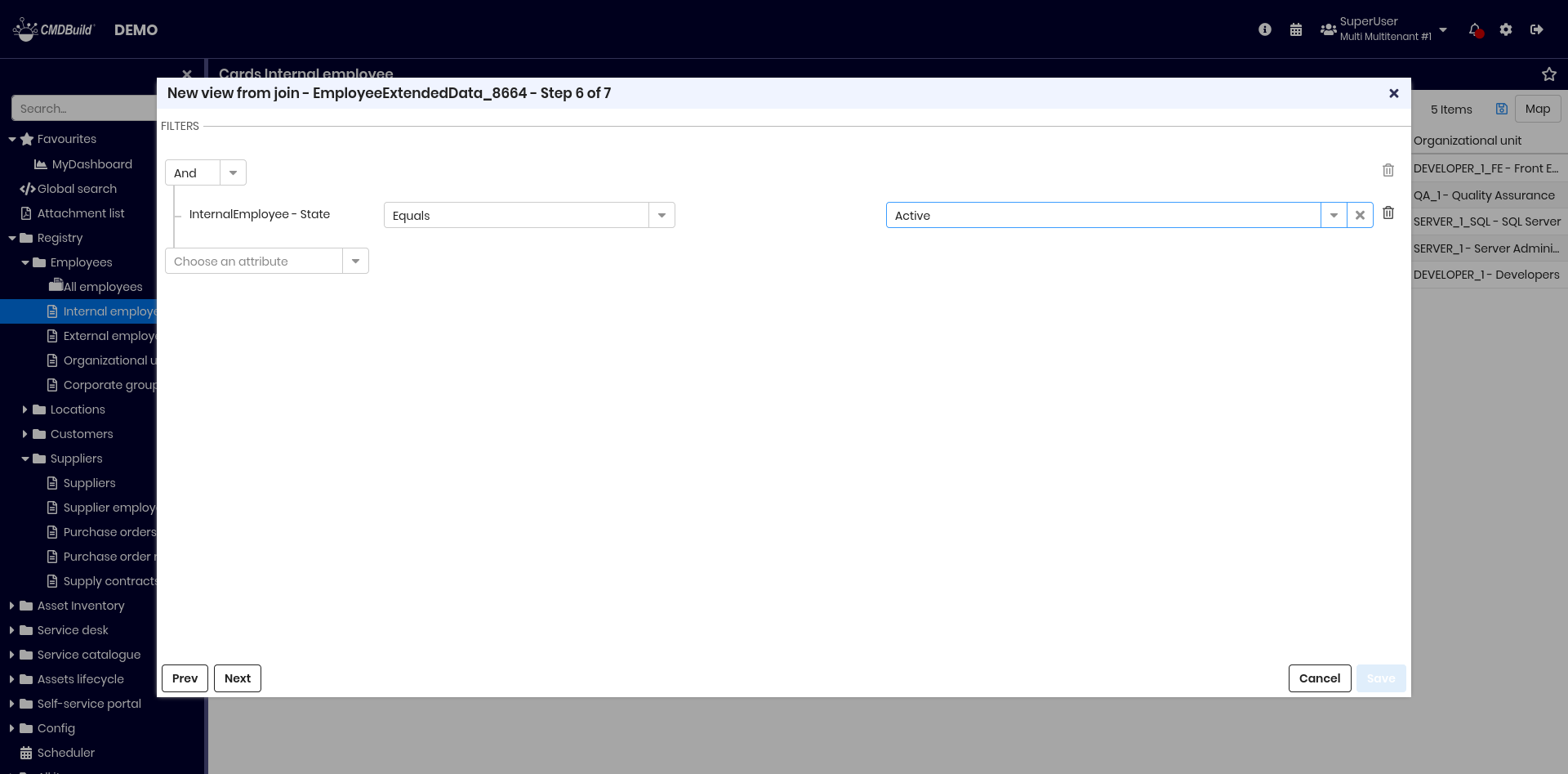
Step 6 — Filter definition
Define filters on selected attributes.
Filters follow the same logic as card filters.
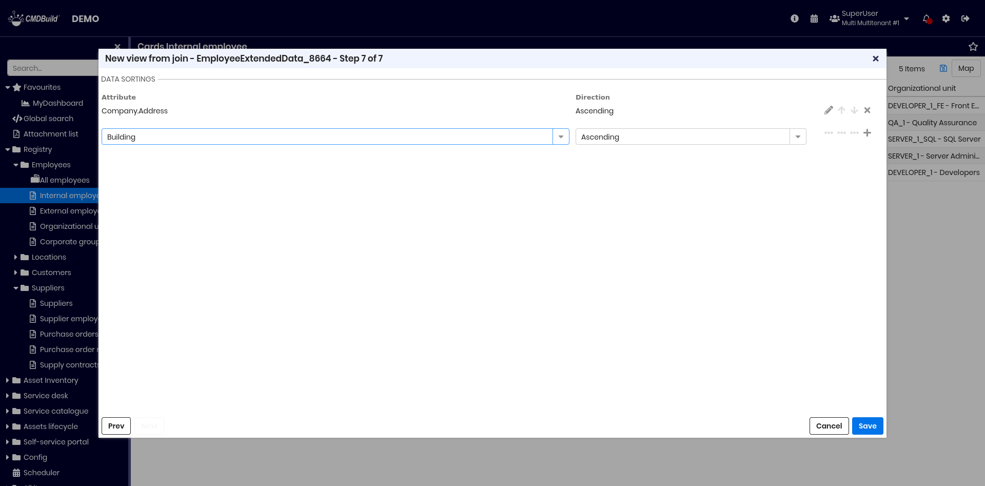
Step 7 — Data organization
Define ordering criteria:
- attributes used for sorting
- sort direction (ascending or descending)
Consultation of a view from join
Views are accessed from the contextual menu.
When selecting a view, the navigation tree switches to the Views section:
Available operations:
- free‑text search
- filter management
- refresh data
- contextual menu features
- print (PDF or CSV)
- save grid configurations
- edit or delete the view (deletion requires confirmation)
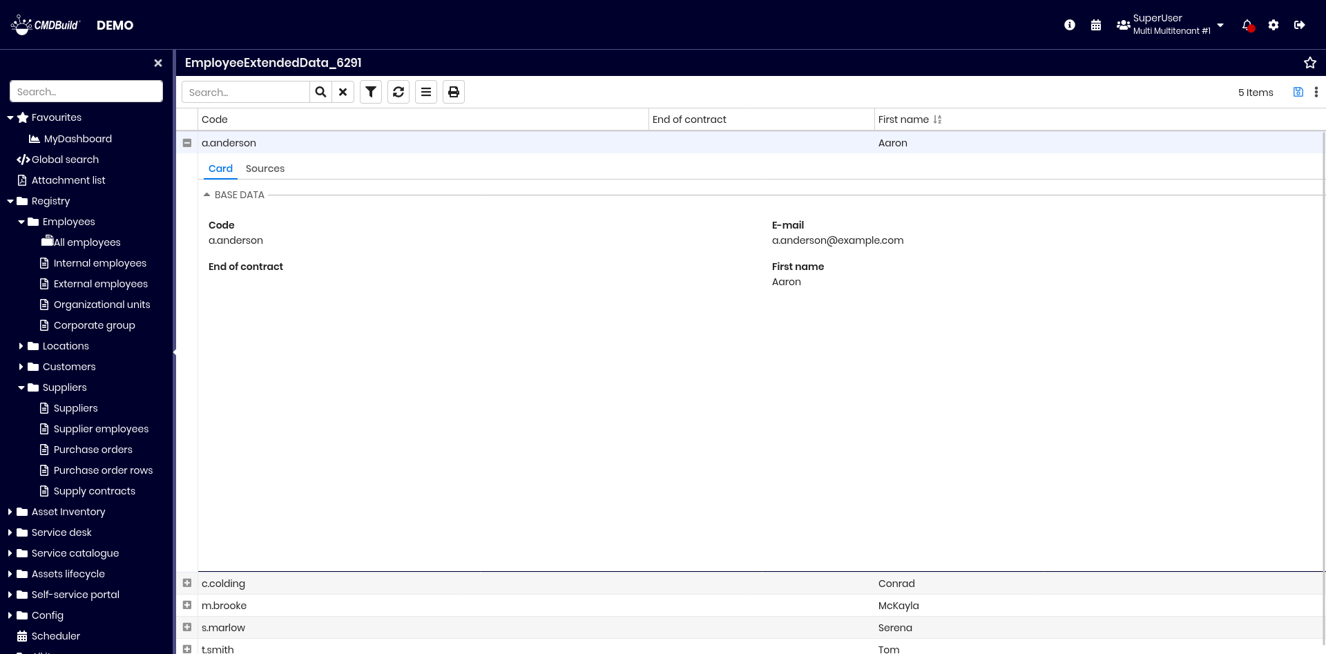
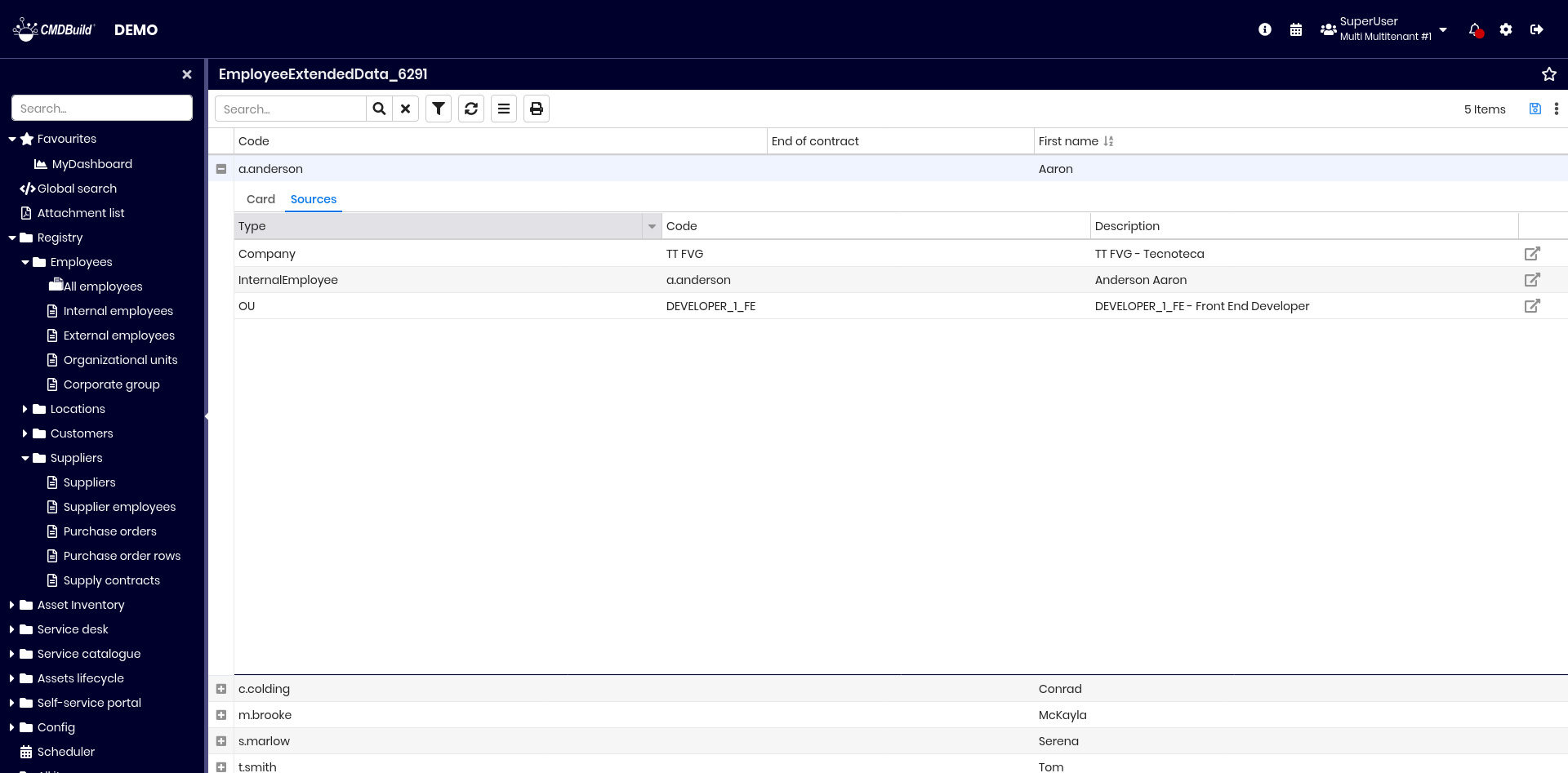
Each row includes two tabs:
- Card — shows selected attributes grouped by fieldsets
- Sources — shows referenced cards with navigation options
Data import / export
This feature allows you to:
- import and synchronize cards and relations from files (CSV, XLS, XLSX) into CMDBuild, or export them to files (CSV, XLS, XLSX)
- import and synchronize cards and relations from relational database tables
- import and synchronize cards and relations from DWG files (2D floor plans)
- import and synchronize cards and relations from IFC files (3D BIM models)
Import and export operations are defined through templates, configured in the Administration Module, which include all required information for each type of operation.
Access to features
Import and export features are available from the contextual menu of classes for which at least one import or export template has been configured.
If templates are available, the contextual menu displays the entries Import data or Export data.
A popup lists all available templates, prefixed by their template type. The operator can then select the desired operation.
Import / export from files
Import
The function opens the popup shown below to import data from CSV, XLS or XLSX files:
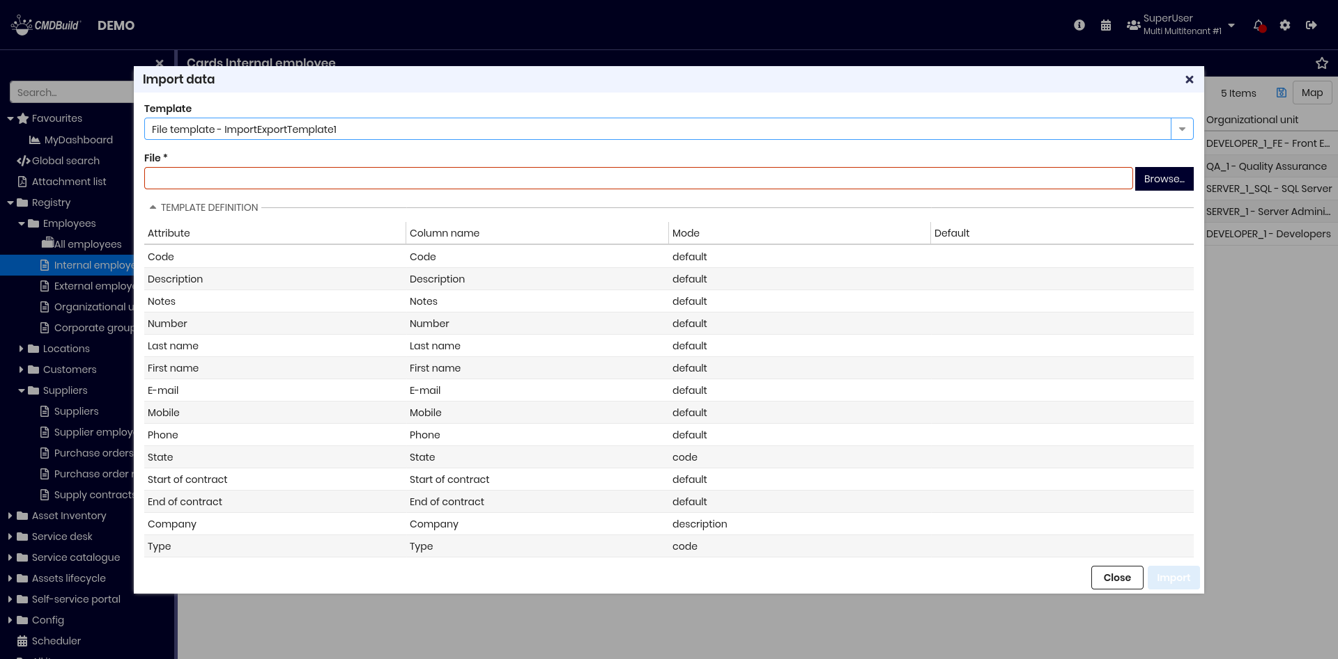
Required fields:
- Template to be used (if multiple templates exist)
- File containing the data to import
The operation synchronizes data in two possible modes:
- Merge mode — imported data is synchronized with existing cards
- Add mode — imported data is added without checking existing cards
At the end of the operation, a summary is displayed showing:
- processed rows
- new cards created
- cards updated
- cards deleted
- cards unchanged
- number of detected errors (with detailed list if present)
The list of errors can be downloaded or sent to the email address configured in the template.
Export
This function opens a popup for exporting data:
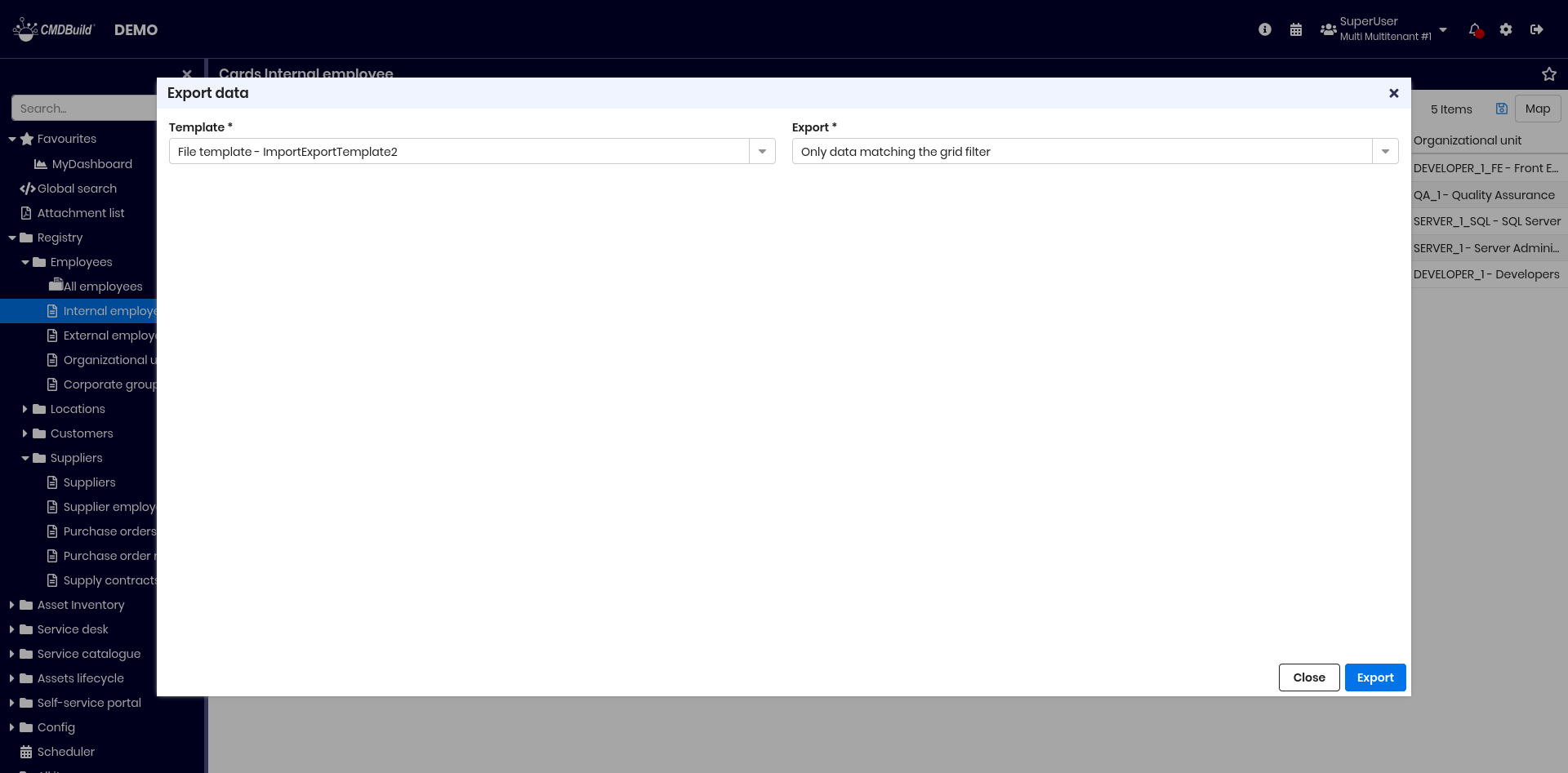
Required fields:
- Template to be used
- Export scope:
- All cards defined by the template
- Only filtered cards currently visible in the grid
- If the template already contains its own filter, exporting only filtered cards is not allowed
CMDBuild exports the data using the template configuration into CSV, XLS or XLSX format.
Import from relational databases
This feature imports data from relational database tables, suitable for straightforward synchronization scenarios.
For more complex integrations, external connectors can be implemented using the CMDBuild Advanced Connector with Groovy scripts.
CMDBuild must be able to access a supported external DBMS (PostgreSQL, MySQL, Oracle or SQLServer).
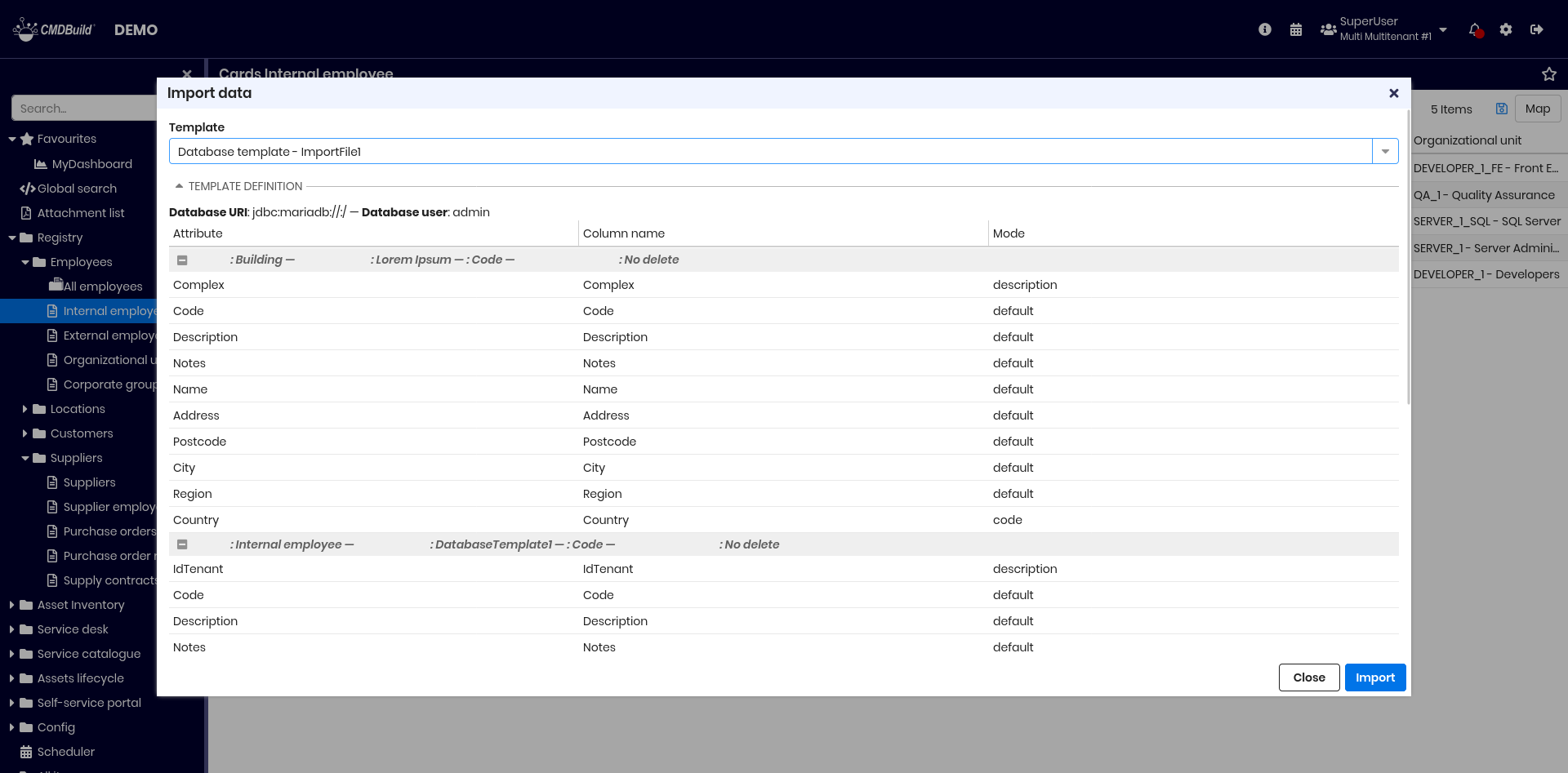
The interface requires only selecting the template, which includes:
- Database: connection string and credentials
- Key attribute: used to match existing cards in Merge mode
- Missing cards behavior: delete, update a field (e.g., status), or ignore
- Mapping criteria: mapping between table columns and class attributes
The summary displayed is identical to file import.
Import from DWG files (2D floor plans)
This feature imports data from DWG files.

Required fields:
- Template
- File: DWG file to import
Template details (read‑only):
- Background objects (non‑CMDBuild entities such as walls, stairs, windows):
- destination class
- import key attribute
- import key source
- For each CMDBuild class populated from DWG content:
- class name
- source layer
- behavior for elements missing in the DWG file
The import works in Merge mode, adding, updating or deleting items as defined by the template.
The summary displayed is identical to file import.
Import from IFC files (3D BIM models)
This feature imports data from IFC files generated by BIM design tools.
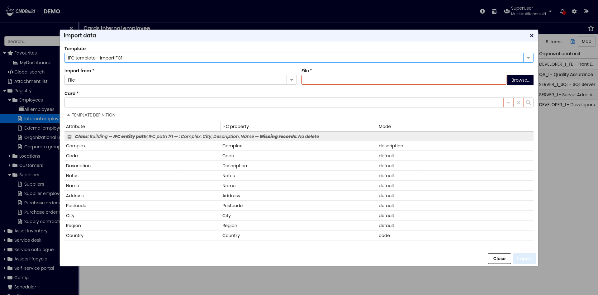
Required fields:
- Template
- Upload type: file or BIM project
- Data source:
- for file: select file and target card
- for BIM project: select project
Template details (read‑only) include:
- class name
- source layer
- import key attribute
- behavior for missing elements
The import runs in Merge mode.
The summary displayed is identical to file import.
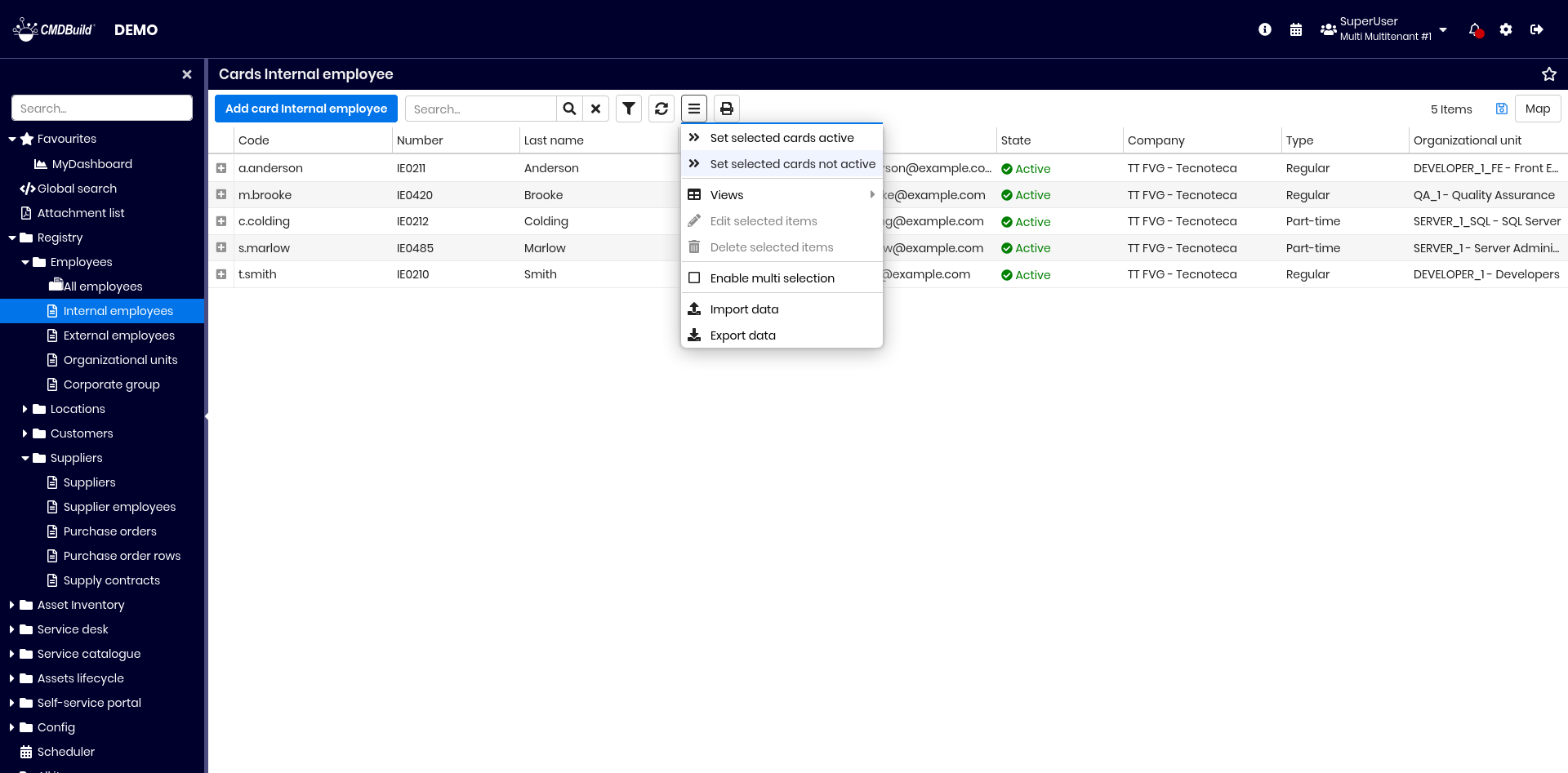
Massive modification and cancellation
The two features described below, if enabled in the Administration Module, allow you to:
- edit one or more attributes of a set of cards selected from a class
- delete a set of cards selected from a class
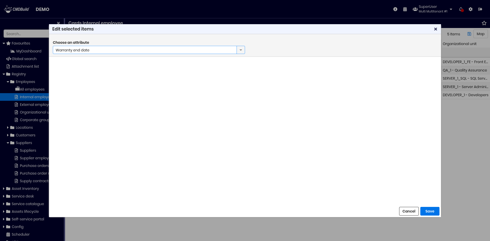
Massive modification
This feature allows you to change the value of one or more attributes for a selected set of cards in the current class.
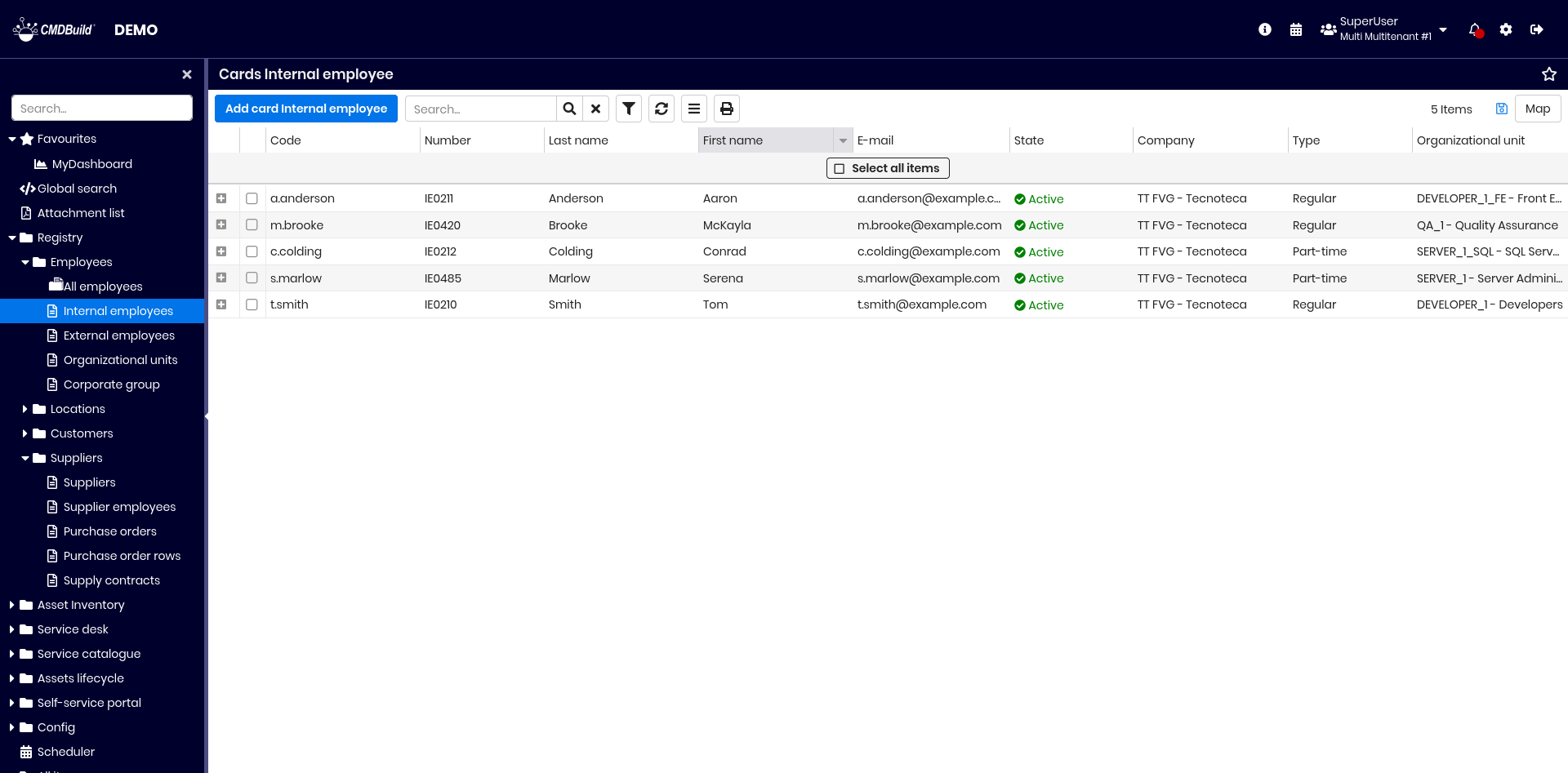
The function is activated from the contextual menu, after enabling multi‑selection.
You can select all rows using the dedicated button or manually select only some of them.
To operate on a specific subset of cards, you can apply a simple filter or an advanced filter. In this case, the select all button applies only to the filtered results.
After selecting the cards, choose the modification entry from the contextual menu.
A popup window opens, allowing you to:
- select the attributes to edit
- assign a new value to each selected attribute
After confirmation, the system displays the number of cards that will be modified.
A second confirmation is required to complete the operation.
Examples of the procedure:
Massive cancellation
This function allows you to delete a set of selected cards from the current class.
As in all CMDBuild operations, deletion is logical.
The selection steps are the same as those described for massive modification.
Once the cards are selected, choose the cancellation entry from the contextual menu.
After confirmation, the system shows the number of cards that will be deleted.
A second confirmation is required to proceed.
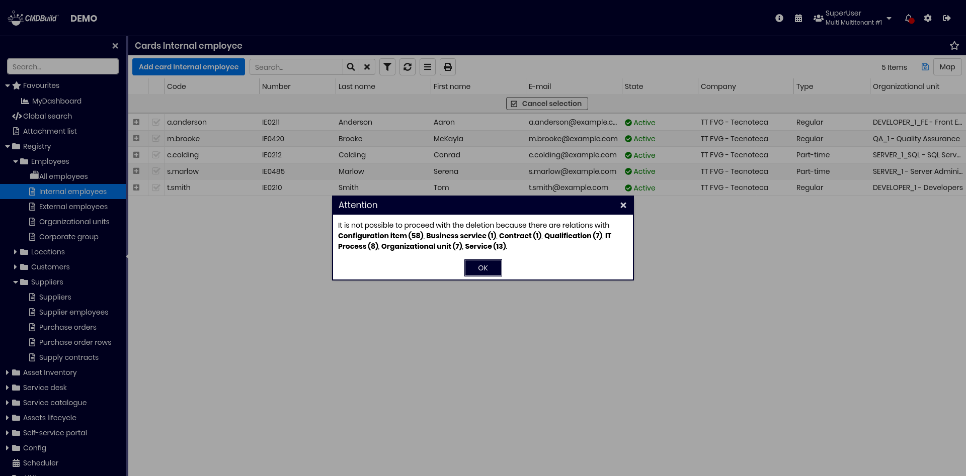
If some of the selected cards have active relations, the system reports the issue and blocks the operation to avoid generating orphan relations.
To bypass this restriction, you can configure in the Administration Module that a card may be deleted even if it is linked through specific relations, and specify that related cards should be deleted automatically as well (cascade deletion).
This configuration must be used with great caution, as it applies to all CMDBuild functionalities, not only massive cancellation, and may lead to unexpected data removals.
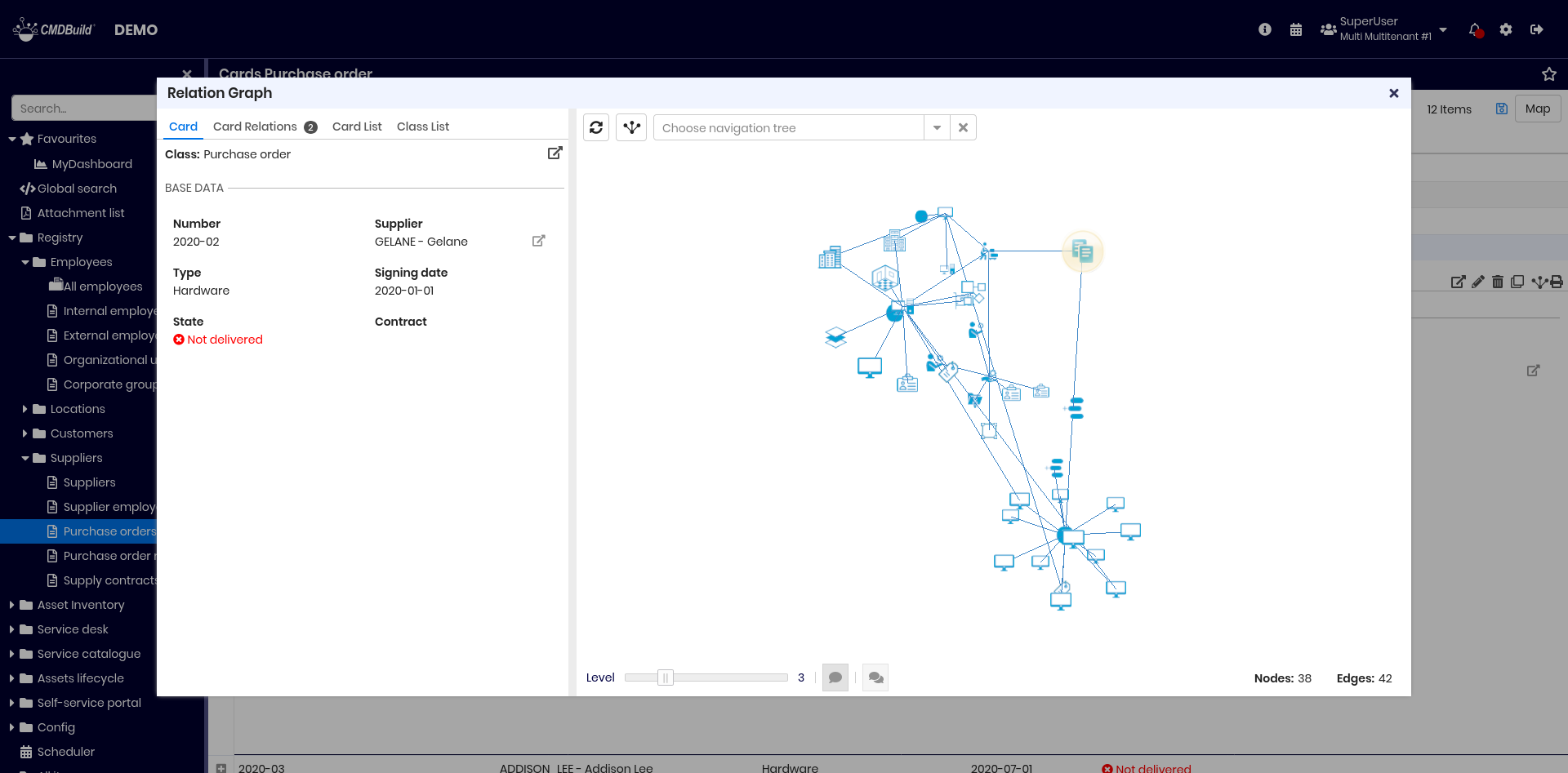
Relation graph
This feature allows you to:
- provide a 3D visual and interactive representation of the relation graph stored in CMDBuild
- perform interactive analysis through filters on cards and relations, graph or node expansion, and predefined filters
General design criteria of the user interface
The user interface is divided into a text area on the left and a graphical area on the right, which are synchronized.
Two toolbars are available: one at the top and one at the bottom.
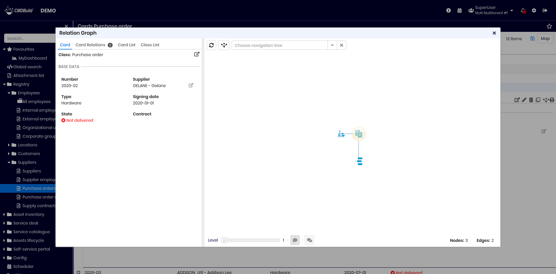
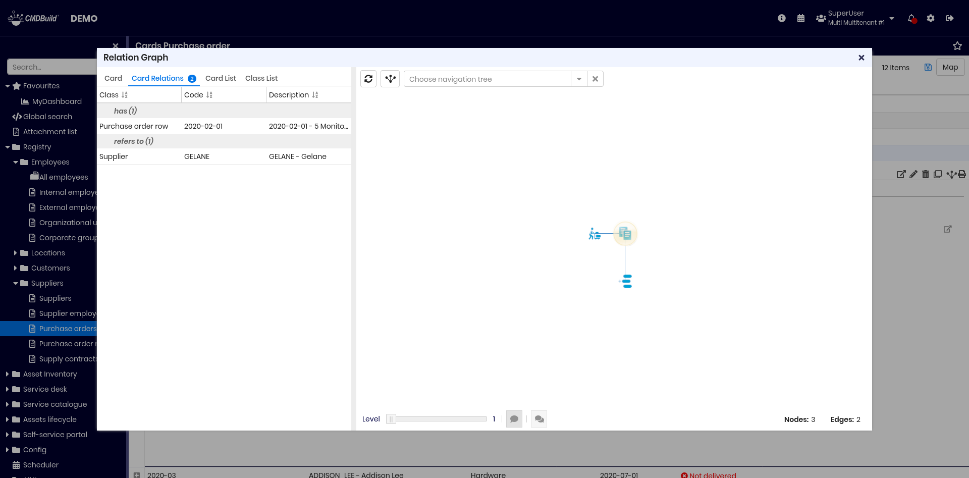
The text area includes:
- Card tab, showing the attributes of the card selected in the graph
- Card Relations tab, showing the list of relations of the selected card, including domain name and description of the linked card
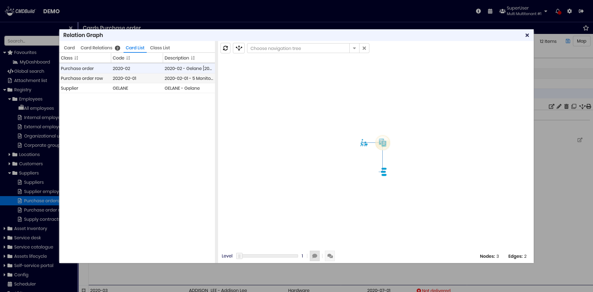
- Card List tab, showing all cards displayed in the graph
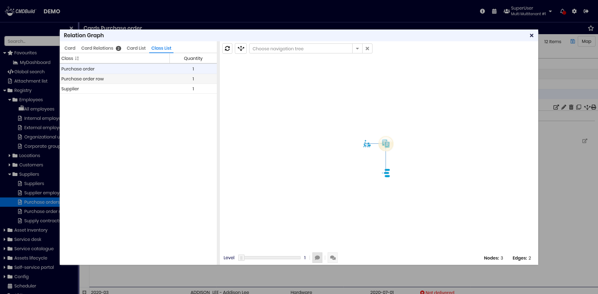
- Classes tab, showing all classes represented in the graph
The graphical area includes:
- nodes, representing the central card and all directly or indirectly related cards up to the selected depth, using class‑specific custom icons (or the default icon if none is defined)
- edges, representing relations among nodes
Each node and edge includes a tooltip with primary information.
The selected node is highlighted in yellow.
Available interactions:
- select a node (left click), updating the Card and Card Relations tabs
- select multiple nodes (CTRL + left click)
- expand a node (double click) to display additional related nodes
- zoom using the mouse wheel
- move the graph (right‑click + drag)
- rotate the graph in 3D (left‑click + drag)
Upper toolbar
The upper toolbar allows you to:
- reload the graph in its initial configuration
- reload the graph centered on the currently selected node
- apply a filter based on a navigation tree defined in the Administration Module
Example of filter usage:

Lower toolbar
The lower toolbar allows you to:
- open the graph at a higher depth level (useful when filters reduce the visible elements)
- show or hide tooltips for nodes and edges
- show or hide labels for all nodes and edges
On the right side of the toolbar, the number of nodes and edges that make up the graph is shown.
Example of a graph expanded to three levels:
Text area
The text area includes the tabs described below.
Card tab
Displays the current card with all attributes, grouped into fieldsets when configured.
The selected card is highlighted in yellow in the graph. Selecting a different card updates the displayed data.

Relations tab
Displays the list of cards related to the selected card. On each row is indicated:
- class name
- code
- description
Card list tab
Displays the complete list of cards currently shown in the graph. On each row is indicated:
- class name
- code
- description
Selecting a card highlights it in the graph.
Class list tab
Displays the complete list of classes represented in the graph, along with:
- class name
- number of elements displayed in the graph
Selecting a class highlights all its cards in the graph.
Georeference on geographical maps
CMDBuild allows you to georeference on geographical maps those entities for which a geographical attribute has been configured in the Administration Module. Geographical attributes can be point, line or polygon or shape.
The map used by CMDBuild is based on OpenStreetMap.
You can access the map using the button located on the far right of the top bar of a class. The same button allows you to return to the list view.
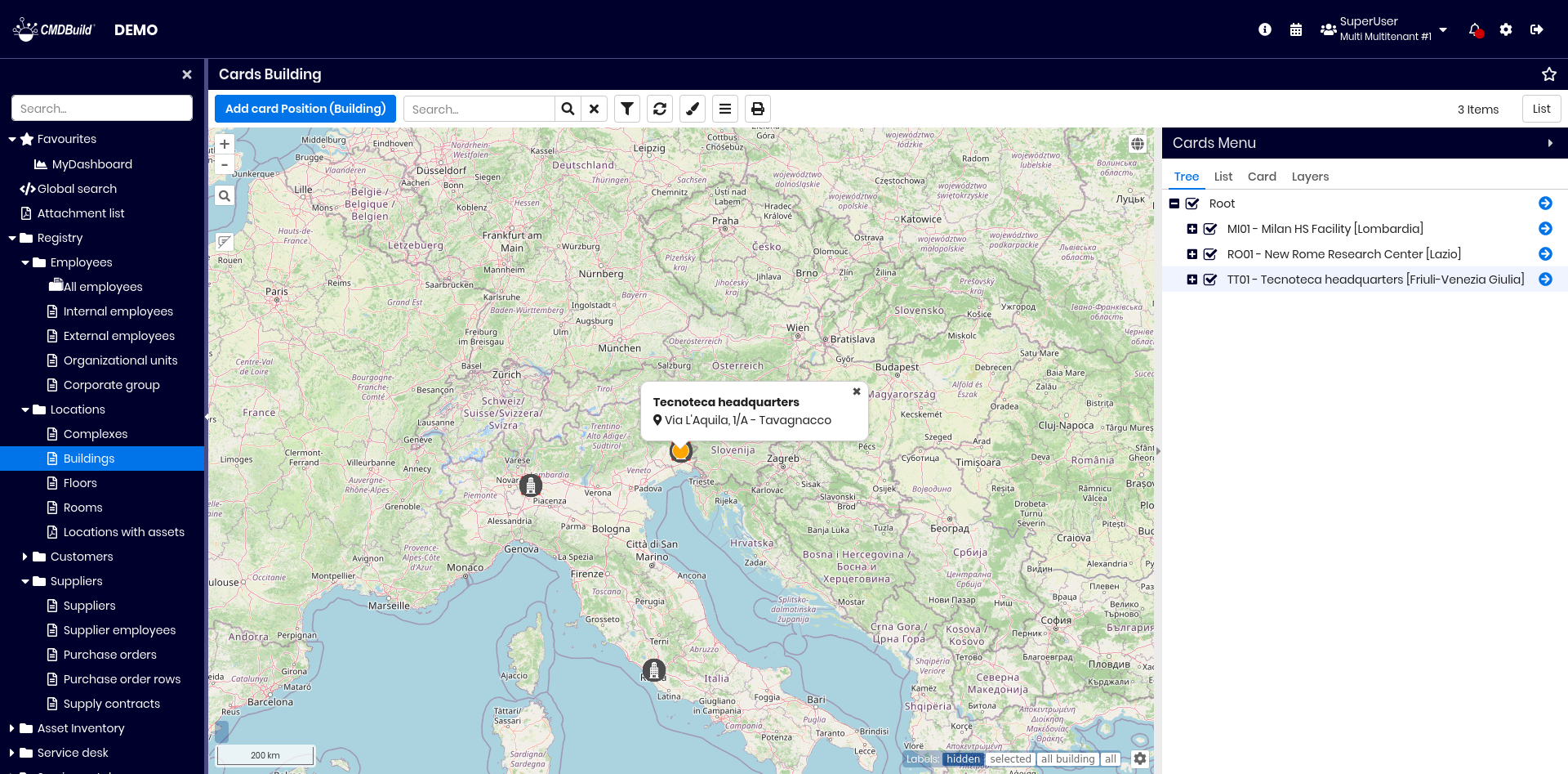
As shown in the image, the selected geographic attribute can display an information window that allows you to view information about the item.
The functions available on the top bar are the same as those of the card list, except:
- when adding a new card, you georeference it directly on the map
- an additional button is available to apply a thematic map
Tools available on the map:
- on the left:
- zoom in and out (or use the mouse wheel)
- search for an address via text input
- show or hide the info window of georeferenced elements
- on the bottom right:
- manage label visibility (hidden, shown only for selected item, shown for items of the same class, or shown for all items)
- set label font size
- on the bottom left:
- view zoom level, mouse‑pointer coordinates and map scale
On the right side, a text area allows interaction with the map representation and includes:
- Navigation tree tab
- Card list tab
- Card tab
- Layers tab
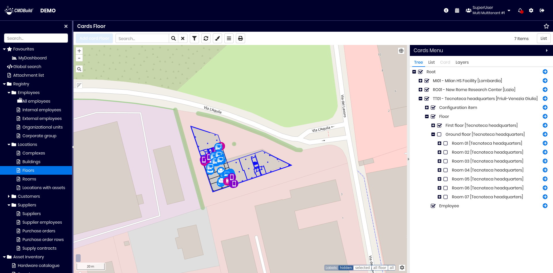
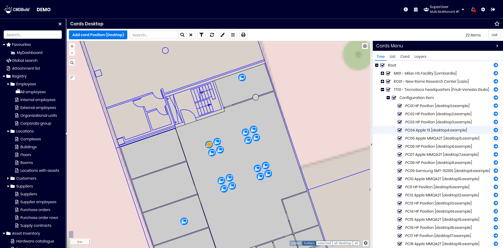
Navigation tree tab
The navigation tree shows the hierarchy of cards georeferenced on the map, based on the GIS Navigation Tree defined in the Administration Module.

The default hierarchy is: Building → Floors → Rooms → Plants / Assets.
The configuration may define that a Floor object represents a single planimetry for each building, with all related items (people, assets, plants, etc.) displayed on it.
You can:
- expand or collapse tree levels
- toggle visibility of each node on the map
- set the application context to a selected class and card, centering the map on it
Card list tab
This tab displays the list of cards of the current class.
It includes all attributes with the Display in the reduced grid flag enabled.

Card tab
This tab displays details of the selected card.
Attributes are grouped into fieldsets where configured.
A dedicated fieldset shows geographical attributes, which can be edited directly on the map.
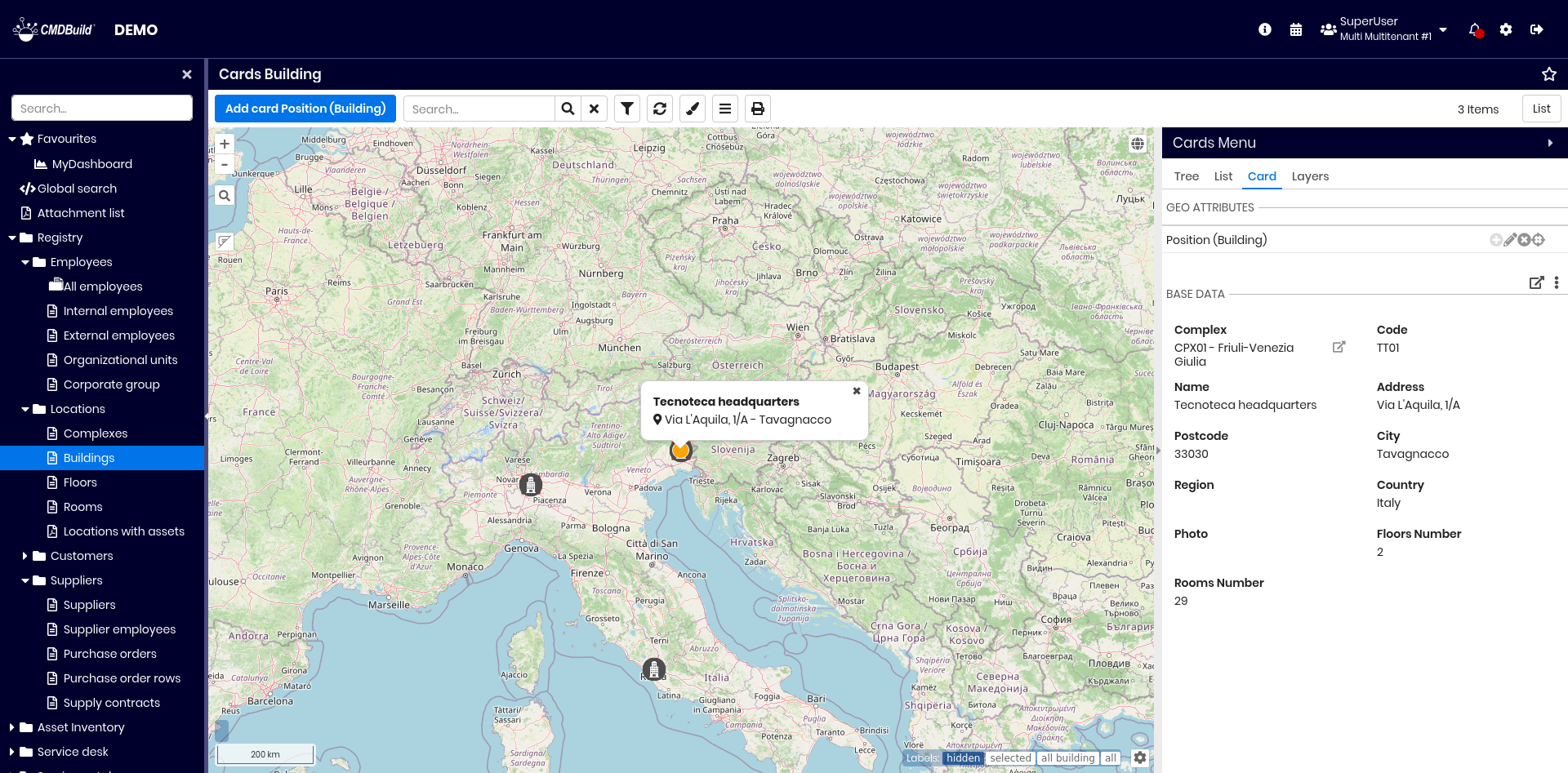
Available operations include:
- on the geoattribute fieldset:
- add a georeference
- edit the georeference
- delete the georeference
- center the map on the georeferenced position
- confirm or cancel when creating or editing a georeference
- on the card fieldset:
- open a popup showing the card data
- use the dropdown toolbar to navigate directly to a specific tab of the current card
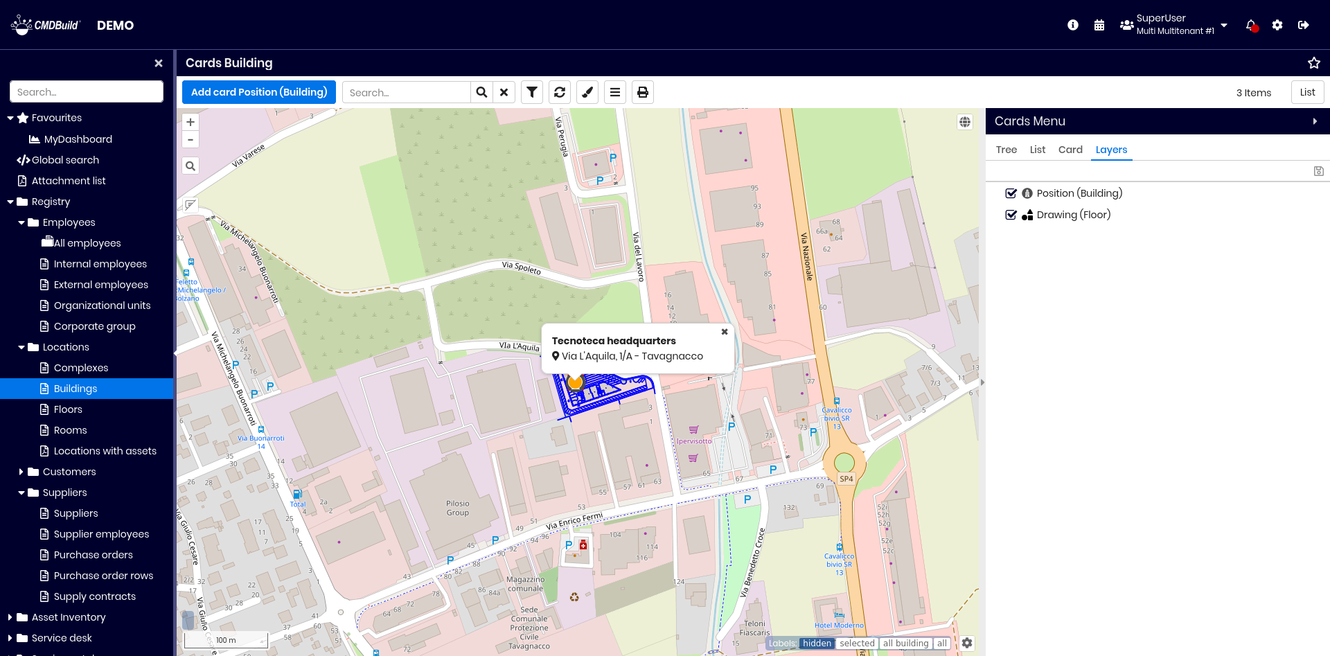
Layers tab
This tab displays the list of layers visible on the map. Layers may include:
- geographical layers (points, areas, polygons) managed in PostGIS
- background vector layers (shape files) managed via GeoServer
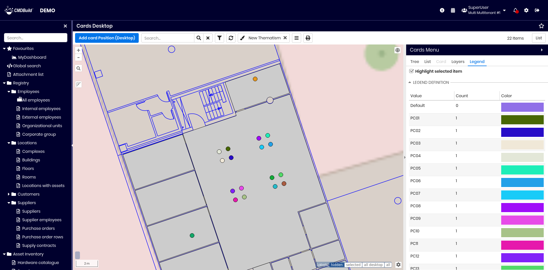
Thematic maps
Thematic maps allow representing card information — such as status, classification, category or type — using colors and symbols on the map.
Using the dedicated button on the top bar, you can:
- add a new thematic map (if none exists)
- access the list of existing thematic maps to add, edit or delete
When creating or editing a thematic map, a popup allows defining:
- Type of analysis:
- Punctual for categorical attributes
- Interval for numerical attributes
- Geographical attribute used for mapping
- Source:
- Table for direct class attributes
- Function for computed values
- Attribute used for generating the map
You can generate style rules automatically.
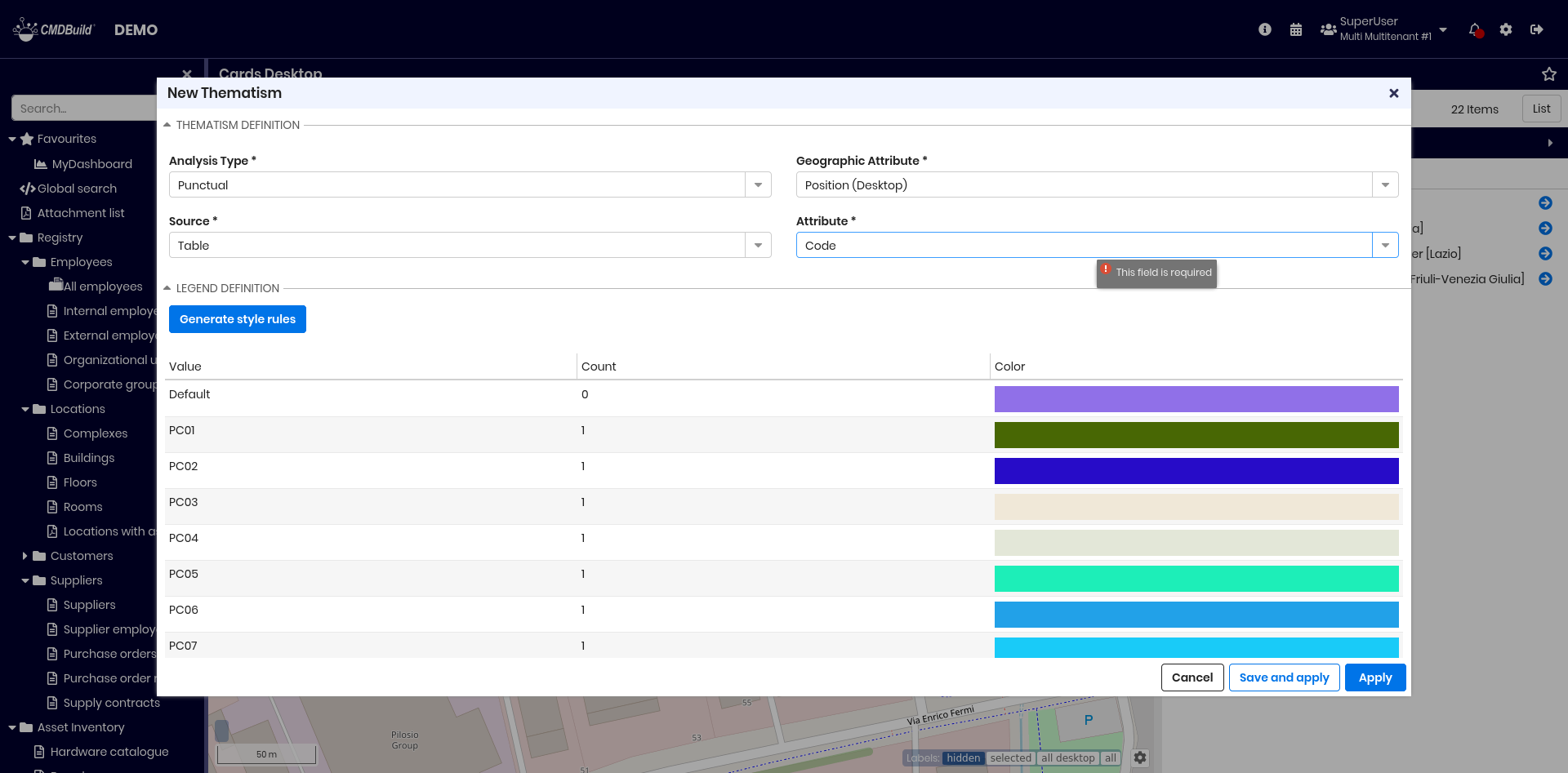
Once applied, a new tab appears showing the legend and allowing highlighting or not the selected item.
Visualization of vector maps and 3D models
From geographical maps, you can access both:
- vector planimetries of building floors (AutoCAD)
- 3D models of buildings (Revit, ArchiCAD)
Vector maps
Vector planimetries appear when zooming into the relevant area.
3D models
3D models can be accessed by clicking the BIM icon, if present.
2D georeference on planimetries
CMDBuild supports georeferencing specific card types — such as rooms, plants, technical items, furniture or employees — on vector planimetries produced with CAD tools.
From any card, you can zoom directly to its position on the planimetry and edit it graphically.
By navigating the planimetry, you can select represented items and open their corresponding cards.
Planimetries can be imported via the dedicated import feature.
All features described for geographical maps are available when working with vector planimetries.
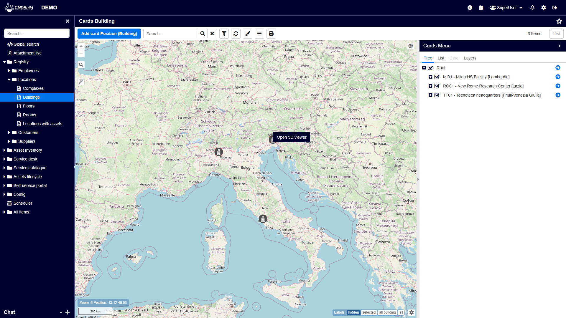
Georeference on 3D models
CMDBuild also manages the georeference of its cards on 3D models imported with BIM design tools (Building Information Modeling), such as Autodesk Revit or Graphisoft ArchiCAD.
The open interchange format used for this purpose is IFC (Industry Foundation Classes).
When a mapping descriptor is configured between IFC entities and the corresponding entities in the CMDBuild data model, synchronization is executed automatically.
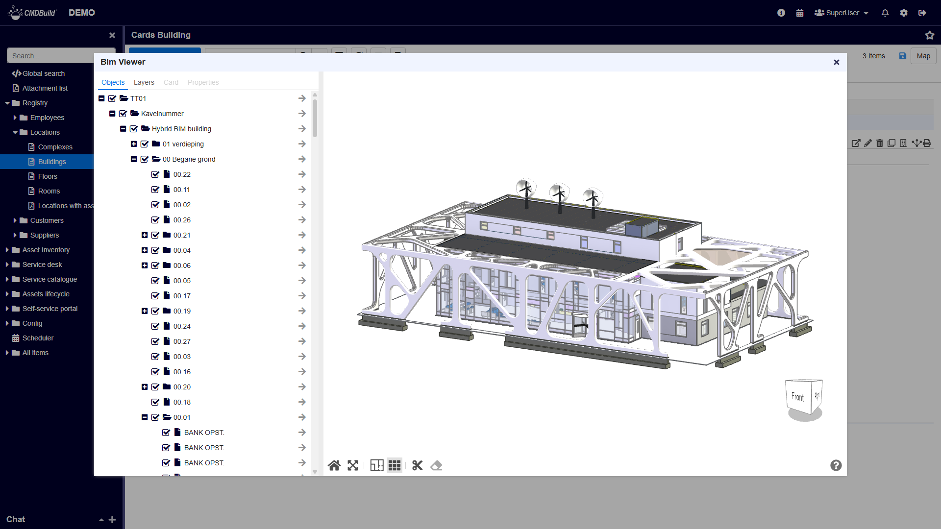
CMDBuild provides an interactive viewer for 3D IFC models, integrated into the standard user interface. This viewer allows you to inspect the interior of a building and its assets in a realistic way.
You can access the 3D viewer using the dedicated button displayed on the map.
Once activated, the viewer displays the 3D model of the selected building, as shown below.
In the 3D viewer you can perform the following base operations:
- rotate the model using the navigation cube (alternative to dragging with the left mouse button)
- move the building model (right‑click + drag)
- rotate the model (left‑click + drag)
- zoom in and out (mouse wheel)
- use the graphic toolbar located under the graphical area
Below are the tabs available in the text area on the left.
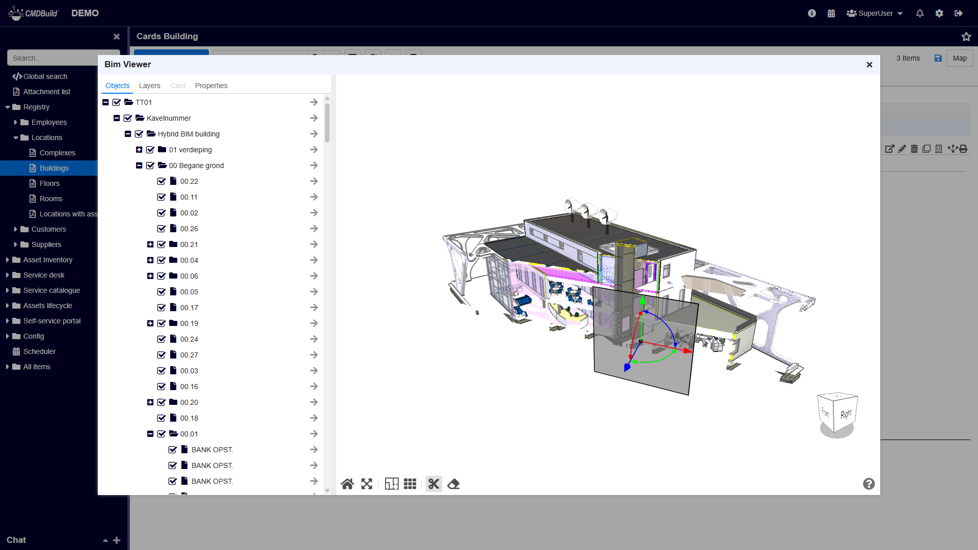
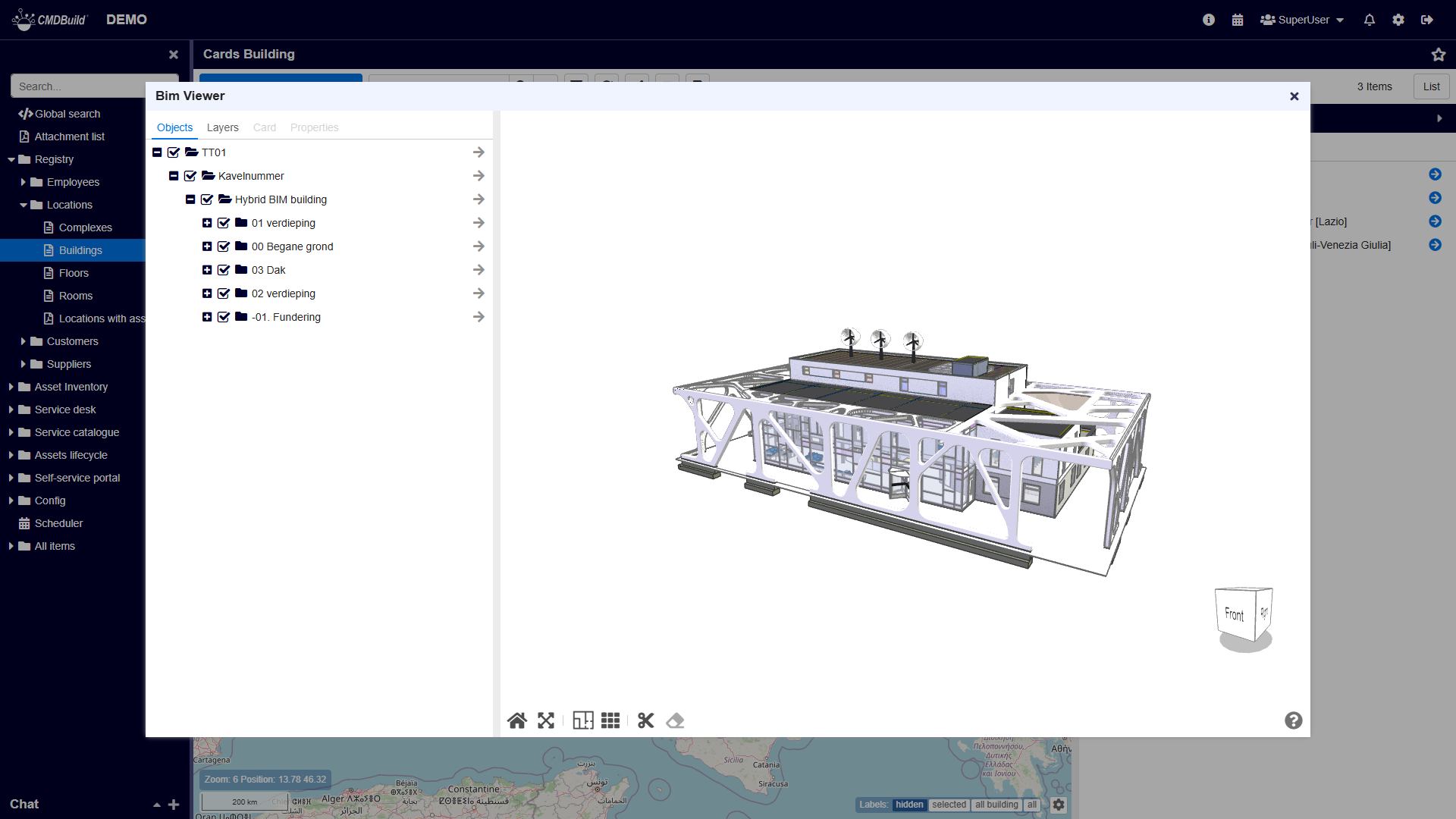
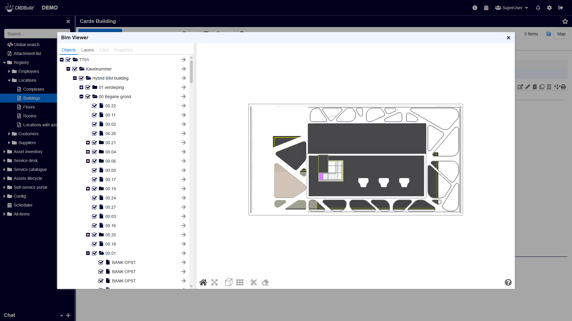
TAB Objects
This tab contains the IFC navigation tree, which shows the hierarchical structure of the items included in the model.
In the Objects tab you can:
- expand or collapse levels of the tree
- center the model on a selected element using the arrow icon
When you click an element in the 3D model, the corresponding item in the navigation tree is highlighted.
At the same time:
- the Properties tab is enabled, showing detailed information about the selected IFC entity
- if the IFC element is associated with a CMDBuild card, the Cards tab is also enabled and shows the related CMDBuild data
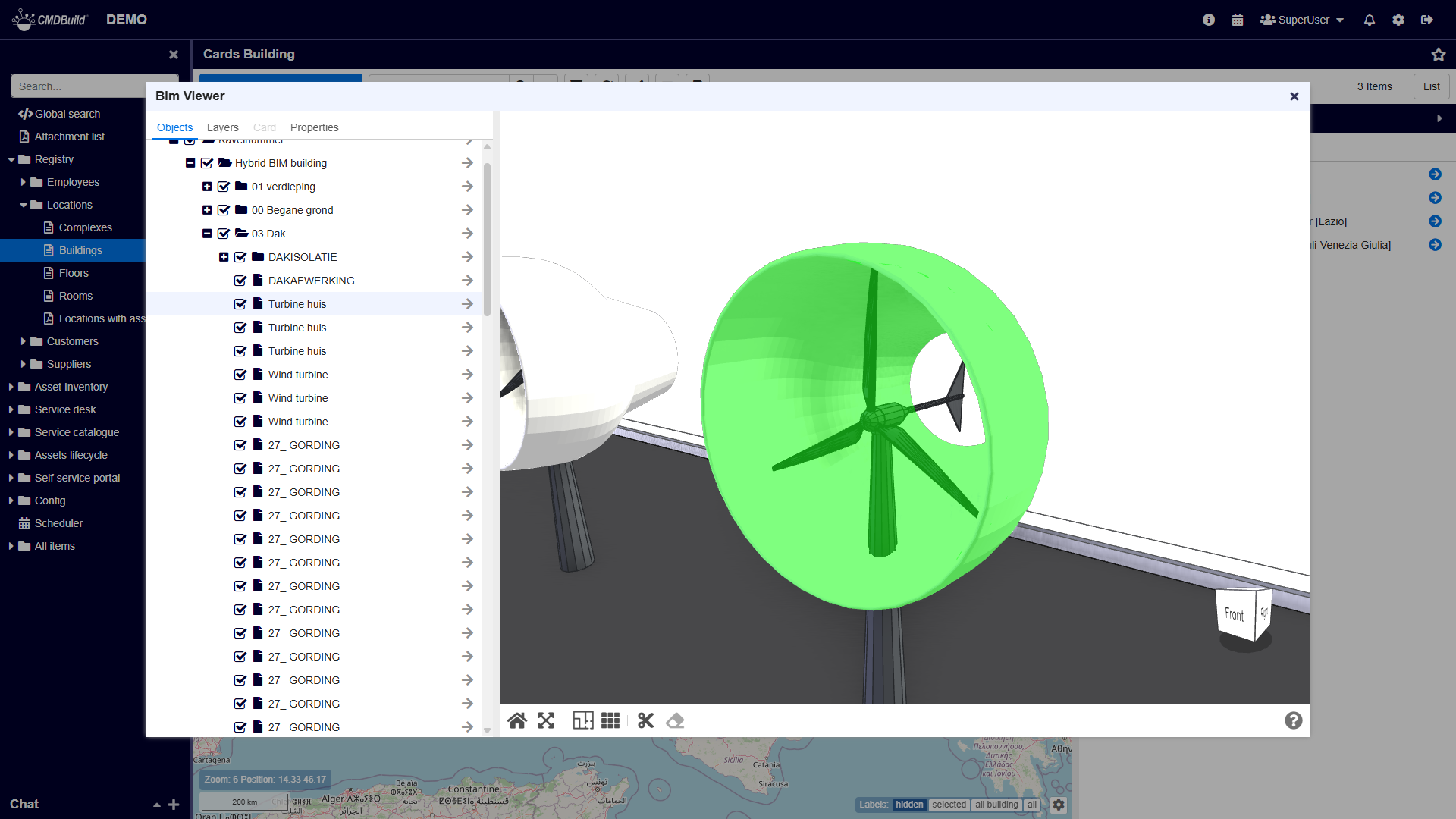
TAB Layers
The Layers tab displays all item types (layers) available in the IFC model and the number of elements for each type.
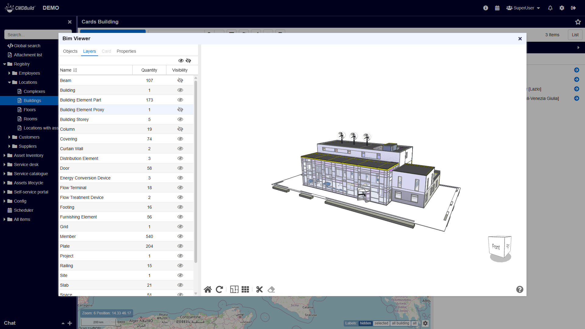
In this tab you can:
- show or hide all items
- show or hide items of a specific layer using the controls in each row
If you click an element in the 3D model, its corresponding layer is highlighted.
In the screenshot above, several layers have been hidden.
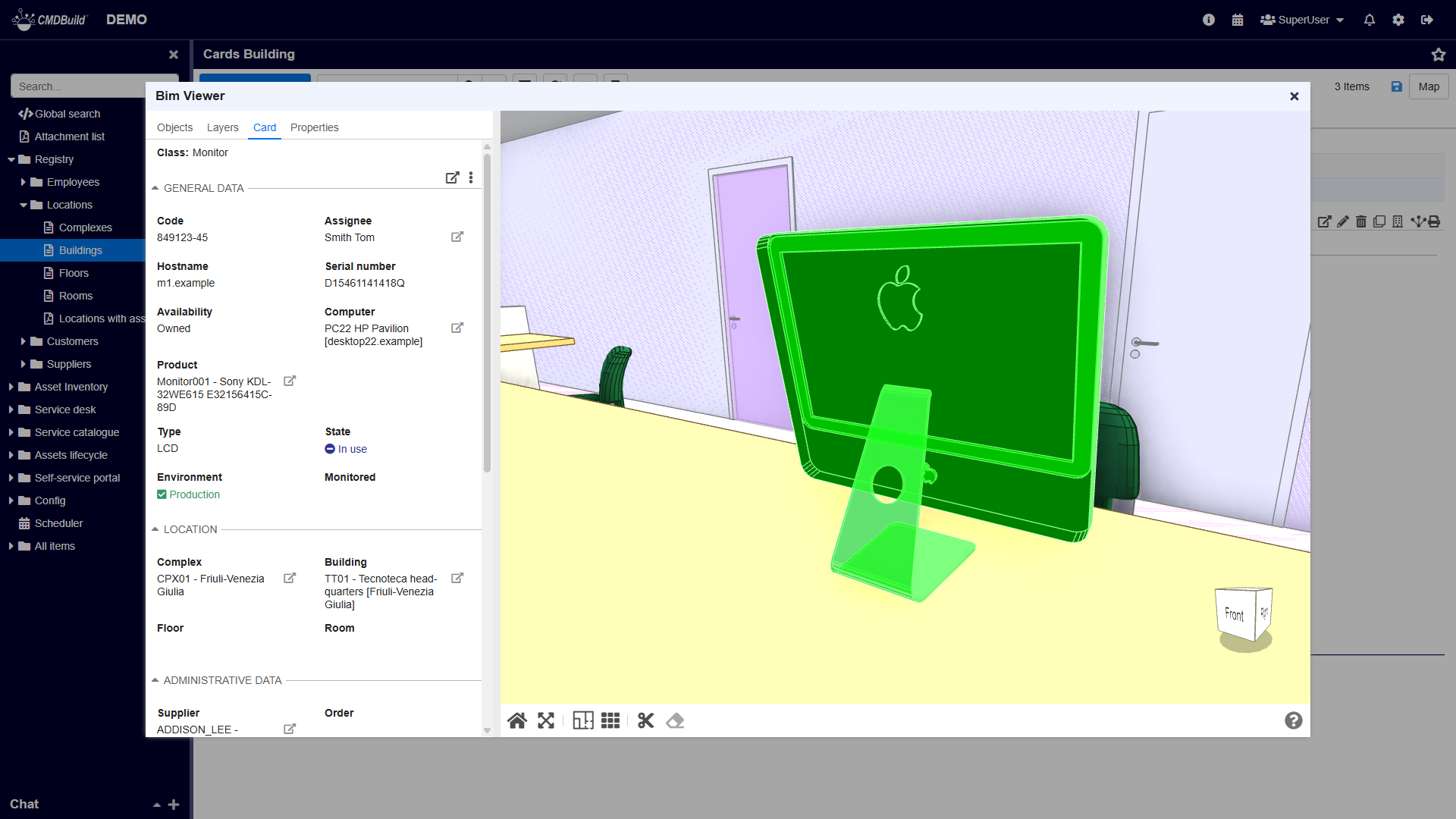
TAB Cards
The Cards tab allows you to consult the CMDBuild card associated with the selected IFC element.
Among the tools available in the associated tab of the card, there is one that allows centering the 3D model on the selected element.
Below is the CMDBuild card of a monitor selected in the IFC model:
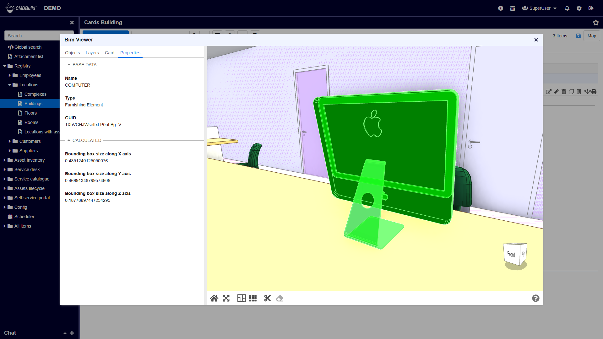
TAB Properties
The Properties tab displays all IFC information of the selected element.
Example of information shown for a selected monitor:
Graphic toolbar
The toolbar located under the graphical area allows you to:
- restore the initial model view (Reset)
- choose the default interaction mode (Pan or Rotate)
- activate 2D view
- activate orthogonal view
- enable the slice tool to cut through the model using an orientable plane and inspect its interior
- remove slice effects
Examples:
2D view
Orthogonal view
Slice mode