Classes
In CMDBuild, a class represents a type of object stored in the CMDB. For each class, the system automatically generates the data management forms, with input fields corresponding to the attributes defined in the class configuration. The information entered in these forms is stored in a dedicated database table, created automatically when the class is defined.
Properties tab
The Properties tab is used to create new classes or modify existing ones.
The available operations include:
- adding a new class
- searching among the configured classes and their attributes
- editing the selected class
- deleting the selected class (physical removal if empty, otherwise logical deletion)
- disabling the selected class (marking it as inactive)
- printing the details of the current class
Each class includes a set of parameters (metadata), organized in the sections described below.
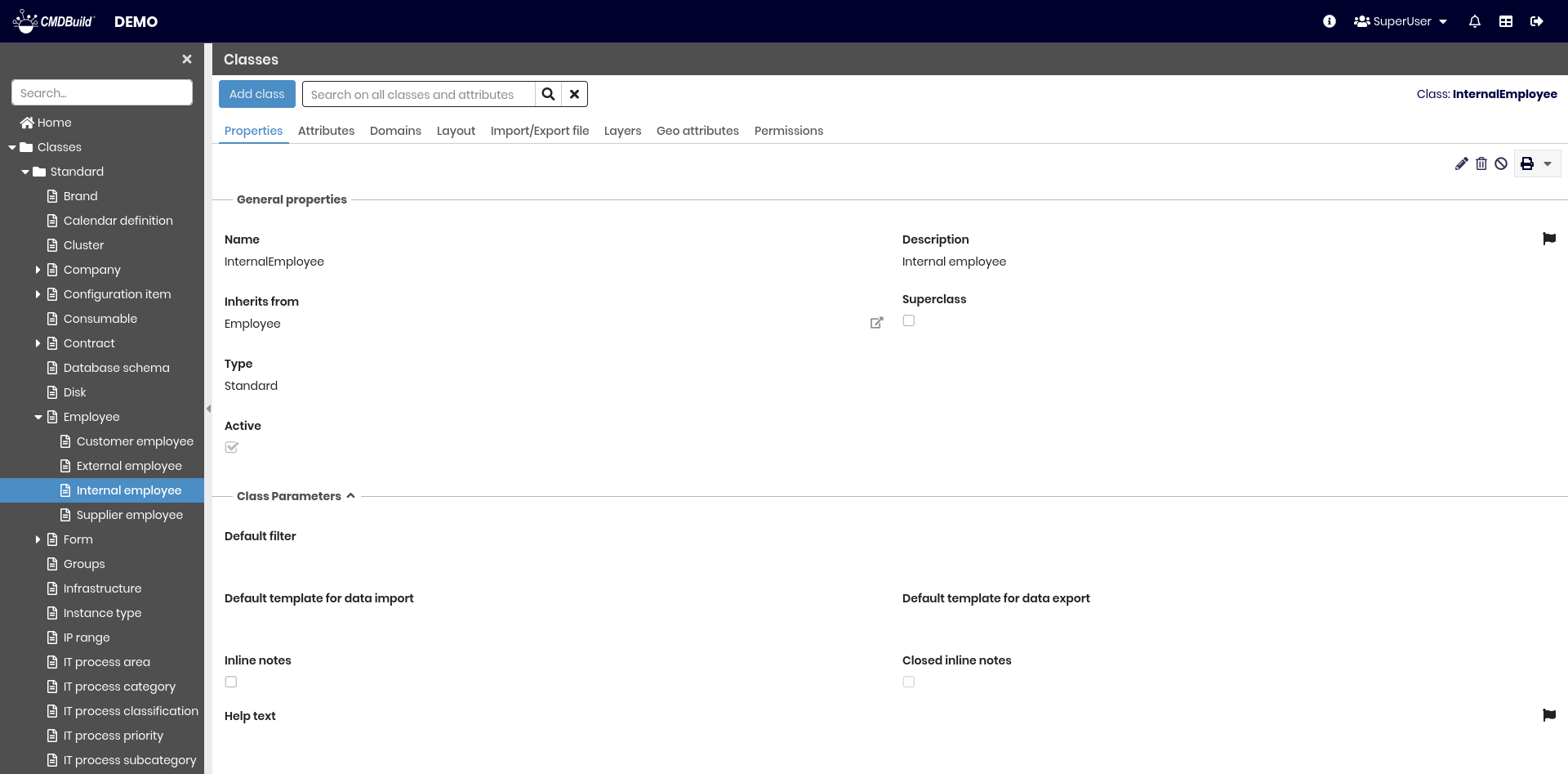
General Properties
The following information is required:
- Name: physical name of the table in the database
- Description: the name displayed in the application. This field is localizable by selecting the flag icon, which opens a popup window for translation into the enabled languages
- Inherit from: superclass from which the new class inherits. If the class is a first‑level class and does not inherit from any other class, the value must remain Default
- Superclass: indicates whether the class is a superclass
- Type:
- Standard: normal CMDBuild class
- Simple: optimized class without advanced mechanisms (no inheritance, relations, history, etc.), suitable for large datasets such as monitoring or IoT data
- Multitenant mode: this option is visible only if multitenancy is enabled in the instance. It defines how the class cards are exposed across tenants and can take the following values:
- Never: cards visible to all tenants
- Always: cards visible only to a single tenant
- Mix: some cards visible to all tenants, others restricted
- Active: indicates whether the class is active and available in the system
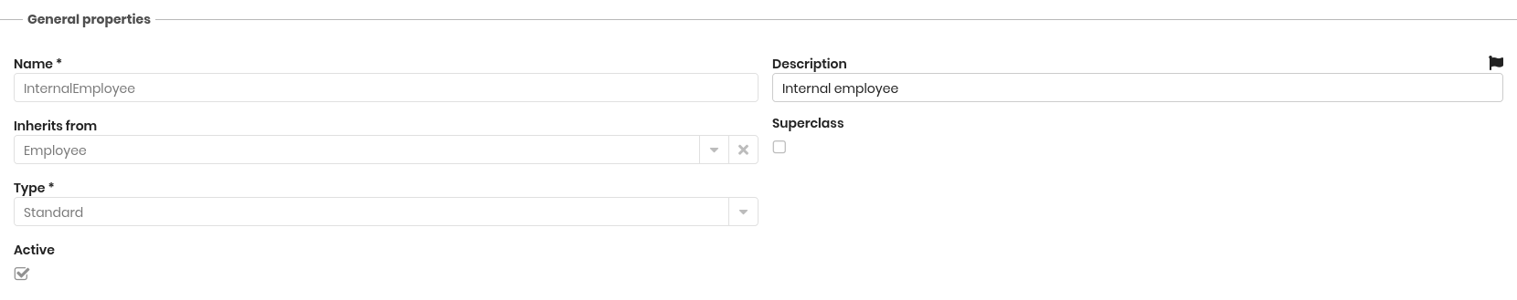
Other Class Parameters
Additional configuration options include:
- Default filter: default filter (chosen among the filters defined for the class) applied to the class card list
- Default template for import: default template to import data into the class
- Default template for export: default template to export data from the class
- Inline notes: includes the Notes field directly in the main card layout instead of a dedicated tab
- Closed inline notes: sets the inline notes fieldset to be closed by default
- Help text: help message displayed in the Management Module (localizable)
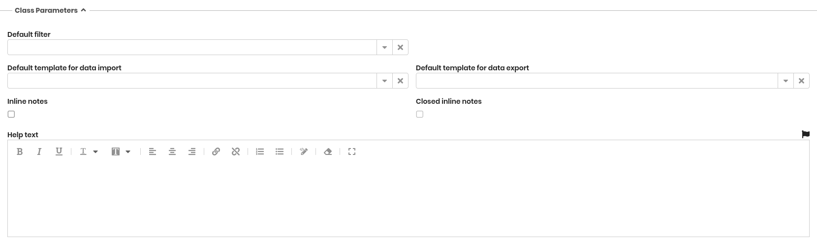
Class Attachments
This section allows configuring how attachments are managed for the selected class.
The available options include:
- Document category: defines the document category used to classify the attachments of the class. If not explicitly configured, the default category defined in the system settings is used
- Inline attachments: displays the attachments list directly within the main card layout (in a dedicated fieldset) instead of using a separate tab
- Closed inline attachments: if inline attachments are enabled, this option determines whether the corresponding fieldset should appear closed by default
Data Cards Sorting
This section defines how cards of the current class are ordered and displayed in the Management Module. It allows specifying which attributes are used for sorting, the sequence in which they are applied and the preferred sorting method.
If no specific configuration is set, cards are ordered by the Description attribute in ascending order.
The configuration defined here affects both the list view and the presentation of related cards in other modules where the class is referenced.

Attribute Grouping
This section allows configuring how attributes of the current class are grouped into fieldsets. Attribute groupings help structure the card layout in the Management Module, improving readability and guiding users through related information.
For each group, it is possible to:
- define the group name
- localize the label into the enabled languages
- specify whether the group should appear open or closed by default when displaying or editing a card
These configurations determine how the attribute fieldsets are arranged in the card form and influence both the visual organization and the usability of the data entry interface.
-be1a84e6e84a5c1b02e1e126dbc4f1e3.png)
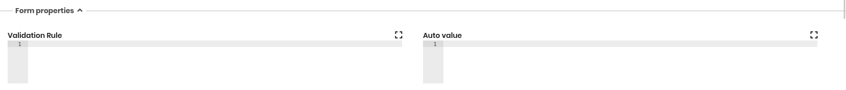
Form Properties
This section allows defining rules that control the behaviour of the form used to create and edit cards in the Management Module. These rules are written in JavaScript and allow the Administrator to validate data, automate field values or adapt the form dynamically according to specific conditions.
The available options include:
-
Validation rules: allow verifying that the data entered in the form meets specific criteria before the card can be saved
If validation fails, the save button is disabled and the card remains in edit mode. Validation logic is written in JavaScript using the editor accessed through the expander button -
Auto value: allows defining JavaScript rules that automatically fill one or more fields in the form based on custom logic
This mechanism is used to compute values, derive information from other fields or apply business rules consistently when cards are created or edited
Form Trigger
Form triggers allow defining operations that are automatically executed in the Management Module before or after a user performs an action on a card, such as inserting, editing, cloning or deleting.
Multiple triggers can be defined for the same class, and each trigger is associated with a specific event and a JavaScript implementation.
The available options include:
- Javascript: the script executed when the trigger is activated
- Event type: identifies when the trigger should run, choosing among:
- before insert
- after insert
- before update
- after update
- before clone
- after clone
- after delete
- Status: enables or disables the trigger
Triggers can be reordered to control the execution sequence when multiple triggers are defined for the same class.
-3f8682605f3460a829cb82cd7e12a025.png)
Contextual Menu
The contextual menu allows adding custom actions that are made available to users when working with cards of the selected class. These actions improve efficiency by providing shortcuts to operations related to the class, directly accessible from the card or from the card list.
For each menu entry, the following options are available:
- Name: label of the menu entry
- Type: defines how the menu entry is implemented
- Component: reuses a component already available in the system library
- Customized: executes custom JavaScript code
- Separator: inserts a separator line between sections of the menu
- Component: component to be reused when the entry type is Component
- Implementation:
- JavaScript code (for custom entries)
- parameter sequence (to launch an existing component)
- Applicability: determines where the menu entry can be used
- only on the current row
- on selected rows
- on all rows of the class
- Status: enables or disables the menu entry
Menu entries can be reordered to define the desired structure and grouping within the contextual menu.
-7ee4e123f5ee2e1244fa8bb2eb94b3e1.png)
Form Widget
Form widgets allow configuring additional functions that appear as buttons in the Management Module and as extra fieldsets in the card layout. Widgets provide shortcuts to common operations and extend the behaviour of the form with predefined or custom actions.
CMDBuild includes a set of standard widgets, and additional custom widgets can be made available if configured in the system. The available standard widgets include:
- Calendar: displays the selected deadlines on a calendar
- Create / modify card: allows inserting or editing a card in another class
- Create report: allows generating and printing a report
- Start workflow: opens a popup window to start the selected workflow, which then proceeds with the standard CMDBuild workflow functions
If custom widgets are configured, they appear in the selection list together with the standard ones. Some additional widgets can be used only within workflows, as described in the Workflow manual.
For each widget, the following parameters can be configured:
- Widget name: label used to identify the widget
- Widget type: selected from the list of available standard and custom widgets
- Activation parameters: the sequence of parameters required to run the widget
- Status: enables or disables the widget
Widgets can be reordered to organize their appearance within the form.
-1927d16656758e2b8303965188c5cf2d.png)
Content Management
This section defines how cards of the current class are displayed and navigated in the Management Module. It allows choosing the presentation mode used when users access the class, ranging from the standard interface to custom or view-based configurations.
The available options include:
- Standard: uses the default CMDBuild page for displaying and managing cards of the class
- Managed with custom page: uses a custom page selected from those configured in the system
- Managed with views: uses a predefined view as the access mode for the class
- Managed with custom addressing: allows selecting a destination page from the available navigation targets for the class
These options make it possible to adapt the user experience to the specific needs of the installation, providing flexibility in navigation design and class‑specific presentation logic.
Icon
This section allows assigning an icon to the class. The icon is used in several areas of the application, including the Relation Graph, to visually identify cards belonging to the class.
The available options include:
- Upload icon: imports a PNG file to associate with the class
- Delete icon: removes the currently assigned icon
If no custom icon is defined, CMDBuild uses the default icon assigned to classes without specific graphical customization.
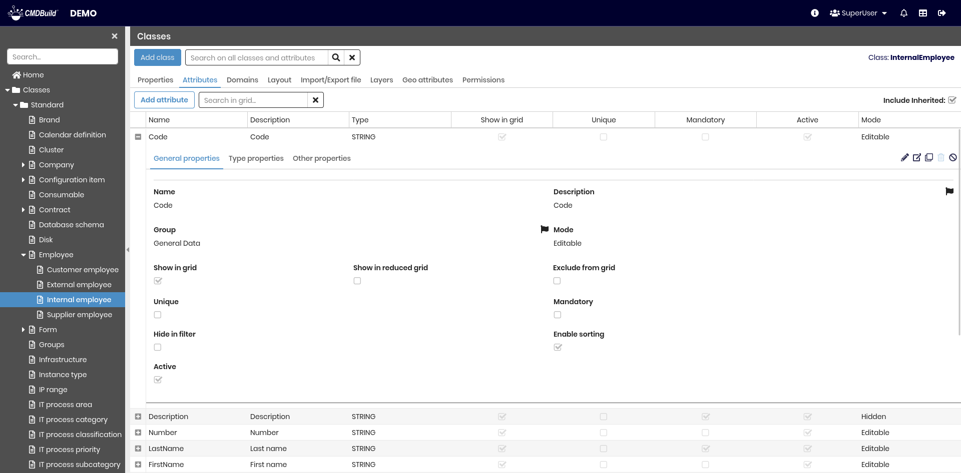
Attributes Tab
The Attributes tab allows managing the attributes of the current class.
Attributes correspond to the columns of the database table associated with the class and can be:
- inherited from a superclass (such as the base system superclass Class, which provides the standard attributes Code, Description and Notes)
- specific to the class
The available operations include:
- creating a new attribute
- searching for an attribute within the class
- showing all attributes or only non‑inherited ones
- expanding a row to display the attribute details in tabs
- editing an attribute
- viewing the full details of an attribute
- cloning an attribute
- deleting an attribute (only if it is not inherited and contains no data)
- disabling an attribute (marking it as inactive)
Each attribute includes a set of metadata parameters, grouped into the sections described below.
For details on available attributes, refer to the Attributes section.
Domains tab
The Domains tab allows managing the relations (domains) defined for the current class. A domain represents a type of relation between two classes, specifying how the cards of one class are connected to the cards of another.
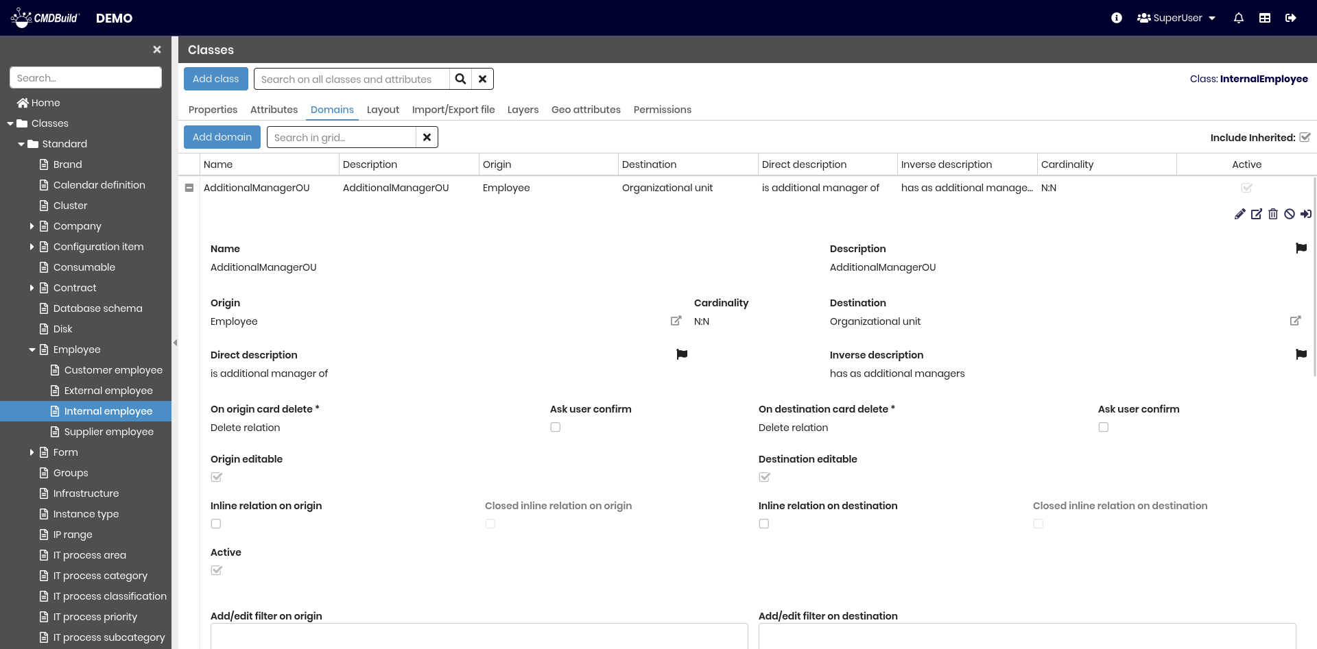
The available operations include:
- adding a new domain
- searching for a domain associated with the class
- expanding a row to display the domain details
- editing a domain
- viewing full domain information
- deleting a domain (only if not inherited and without data)
- disabling a domain (marking it as inactive)
- opening the complete domain configuration page
For details on domain configuration, refer to the Domains section.
Layout Tab
The Layout tab allows defining a custom layout for the class form, specifying how attributes are arranged when cards are displayed or edited in the Management Module.
A custom layout lets the Administrator organize the form into rows and columns and choose the exact placement of each attribute within the available cells.
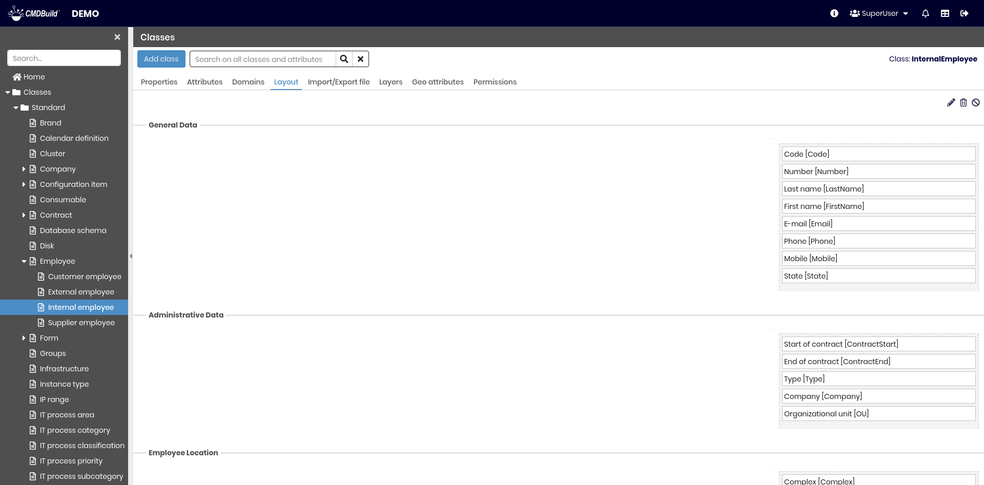
The available operations include:
- creating or editing a custom layout
- deleting the layout
- disabling the layout (marking it as inactive)
Configuring a Custom Layout
A custom layout is defined independently for each attribute group (fieldset). The available configuration options include:
- adding or removing rows
- moving rows up or down
- adding or removing columns
- adjusting column widths
- placing attributes into the layout using drag and drop
Once saved, the custom layout is applied automatically when displaying or editing cards in the Management Module.
If a class has no custom layout, the form is displayed using the default two‑column configuration defined in the Attributes tab.
Attributes not included in the custom layout are also displayed according to the default organization defined in the Attributes tab.
Import/Export Tab
The Import/Export tab displays the list of templates configured for importing and exporting data to and from the class.
Templates can be used interactively through the contextual menu in the Management Module or in batch mode by configuring a dedicated task in the Task Manager.
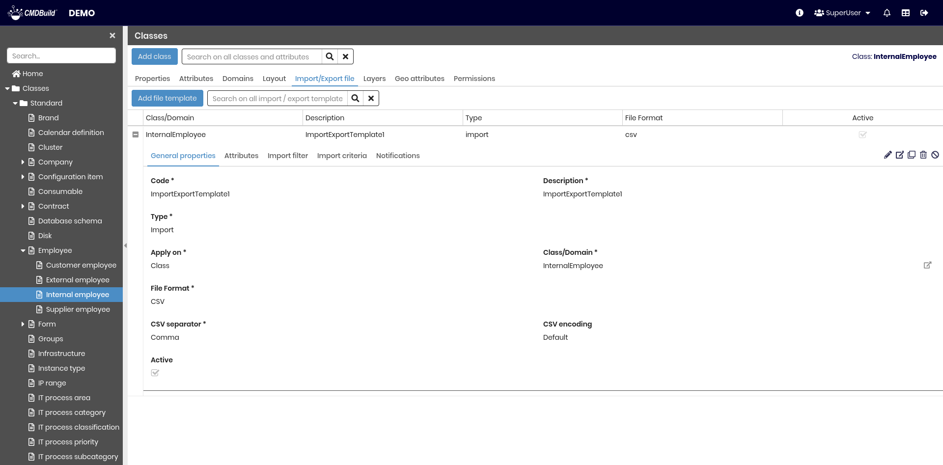
Templates define all the parameters required for a complete import or export operation, avoiding the need to manually specify options each time.
The available operations include:
- creating a new template
- searching templates in the list
- expanding a row to view the template details
- editing a template
- viewing full template information
- cloning a template
- deleting a template
- disabling a template (marking it as inactive)
For a detailed explanation of template configuration and usage, refer to the dedicated section of the manual.
Layers tab
The Layers tab displays the list of all geographical layers available on the map for the current class.
Layers may represent geographic attributes belonging to CMDBuild objects (such as room perimeters or device positions) or external background layers loaded from other systems (such as floor plans showing walls, windows or staircases).
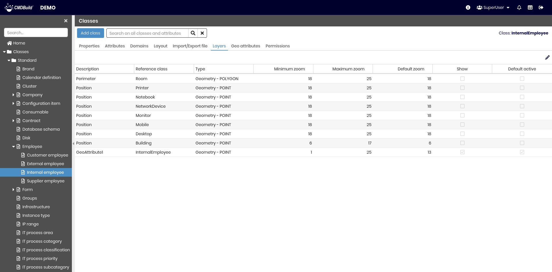
The available operation includes:
- editing the visibility of the layers associated with the class
When selecting the edit icon, the list of layers is displayed. For each layer, visibility settings can be modified.
Geographic Attributes Tab
The Geographic attributes tab allows managing the geographic attributes of the current class.
Geographic attributes define how objects of the class are represented on a map and control their visibility, geometry and styling.
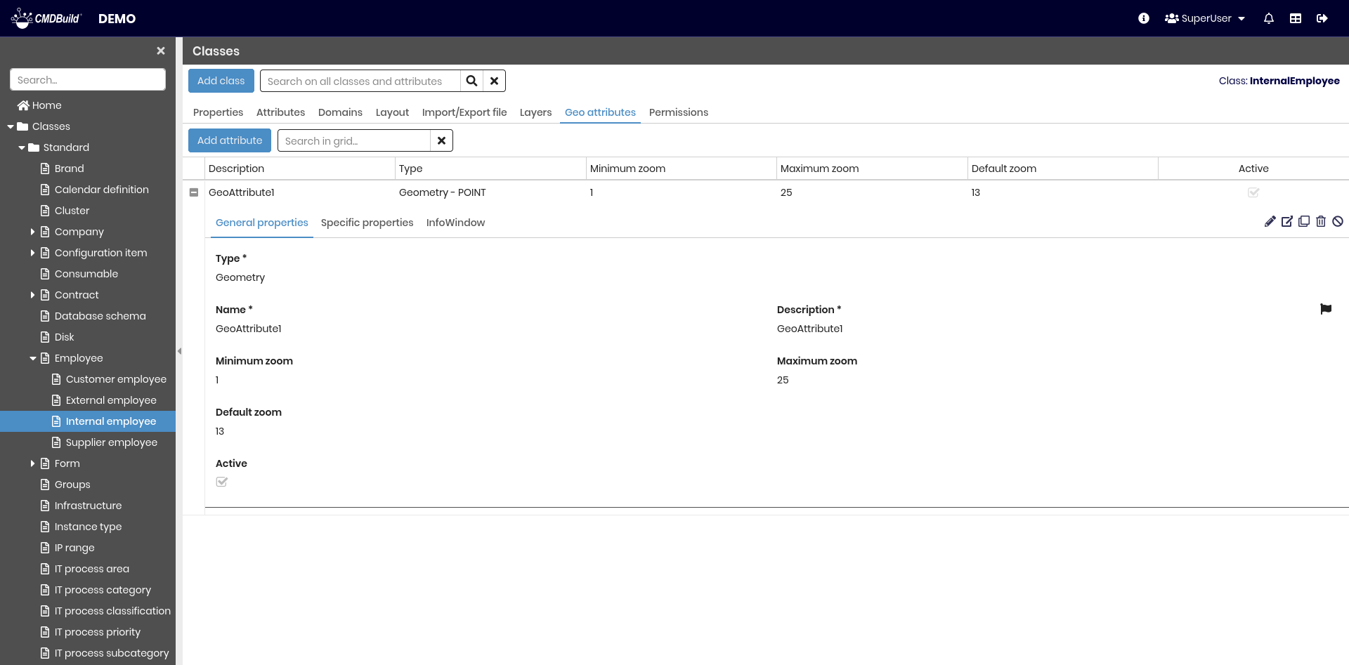
The available operations include:
- creating a new geographic attribute
- searching for existing geographic attributes
- expanding a row to display attribute details
- editing an attribute
- viewing complete attribute information
- cloning an attribute
- deleting an attribute (only if not inherited and without data)
- disabling an attribute (marking it as inactive)
Each geographic attribute includes several metadata parameters, grouped into the sections described in Geographical Attributes section.
Permissions Tab
This section allows configuring permissions on the current class for specific user groups.
Permissions determine which operations each group can perform on the class and its data.
For details on permission management, refer to the relative section.